I create intuitive, succinct information structures, hierarchies, categorization, navigation and metadata. I present this information in various formats enabling stakeholder’s a thorough understanding of where information is positioned and how they may navigate to it.
I create lofi wireframes to provide schematic blueprints of interfaces before further developing these to hi-fi wireframes which provide a more complete representation of the product. Figma is my current tool choice.
I create hi and low fidelity prototypes with specialist software Figma, Sketch, Invision or in html frameworks (Bootstrap).
I gain an understanding of user needs, motivations and behaviours through processes of observation, in-depth interviews and questionnaires. I create user personas including goals and desires which guide decisions about interactions, layout and visual design.
I utilize my graphic design and typographic skills to support the creation of usable interfaces. Taking advantage of Figma for visual layouts ensuring an aesthetically pleasing result balanced with technical functionality and responsive design.
I develop and maintain robust design systems, creating assets shared across both design and development teams. This helps streamline design processes and ensures consistency across all digital products.
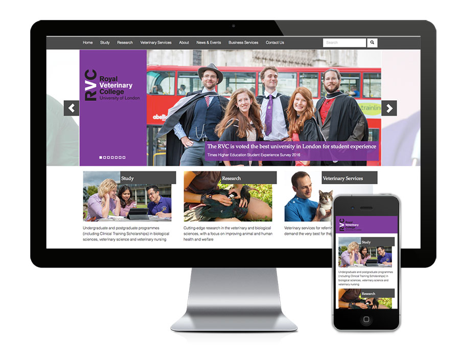
To create a dynamic, interactive responsive site using emerging technologies. A contemporary interpretion of the college visual identity whilst still embracing corporate guidelines. A content managed system providing access to an extensive number of site editors and content contributors.
A complex structure of education, research, veterinary medicine hospitals, farms and an international business hub each competing for prominence on the site.
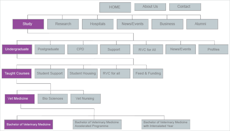
Defining, grouping and prioritizing information structure started from the top, workshopping with senior management to define key operational areas of the college. Once identified additional workshops were facilitated with each key areas to further define structure. The example below provides snap shot of information structure defined through the key area of Study.
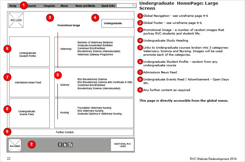
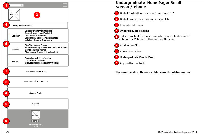
I developed wireframes outlining individual element placement and functionality. The biggest challenge to create a consistent layout across numerous subsections with vastly different target audiences and subject matter.
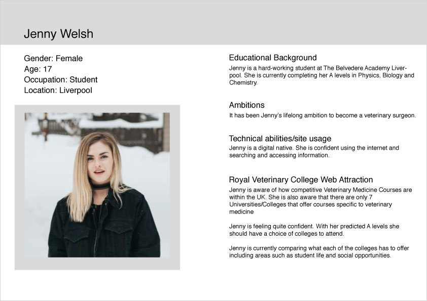
Consulting with various member of each of team personas were developed to ascertain typical users and how they may access and navigate the site. Due to the broad subject nature the personas varied significantly. For example some typical users included:

Early in the project Orchard Content Management System, a Microsoft .Net open source platform was chosen as the basis for the content management system. Due the quick nature of developing pages and navigational structure within Orchard we created rapid prototypes demonstrating user movements and interactions based on the wireframes. In some cases such as for home and landing pages hi-fidelity screens were developed in Photoshop to present a more holistic view of how the project would look and feel. These rapid prototypes were used for early user testing and further approval from upper management.
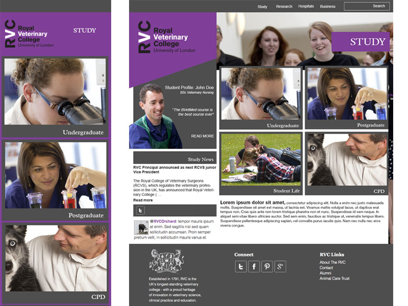
Being central in the development of the User Experience I had a strong idea of the direction that I wished to take the project visually. Screenshots were developed within Photoshop based on the wireframes. A visual experience incorporating extra large screens down to mobile devices was parammount. The use of large background images on larger screens helped achieve this with CSS media queries removing these from smaller devices. The example below is an early iteration of the study landing page for large screen and small devices
I worked with a developer to create the Orchard Themes of the project. My role here was to use a Bootstrap parent theme and edit HTML and CSS providing a look and feel that reflected the mock that I had created in Photoshop.
Being central to the design process it was imperative that testing was undertaken by an external company that was not involved in the design and build process. We provided user profiles developed from the personas for the company to recruit. Two way mirrors, eye tracking software, task analysis were used for the user testing.
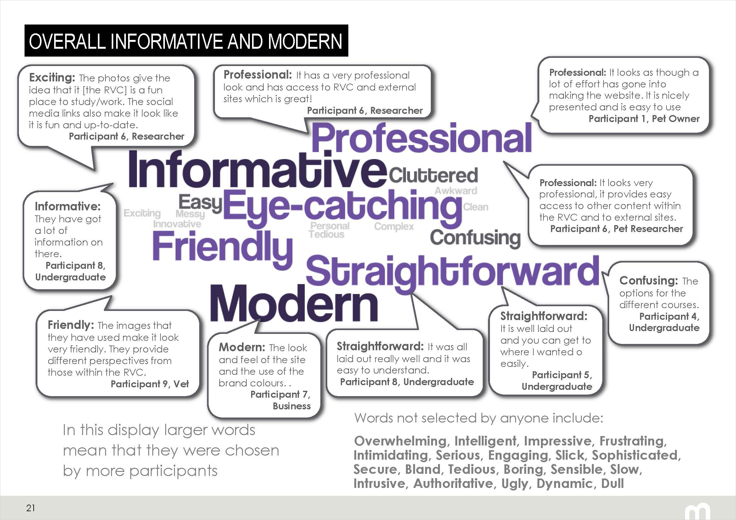
During the testing process users were asked to choose from a list of words they would use to describe the site. The response displayed in the word map below was very positive.
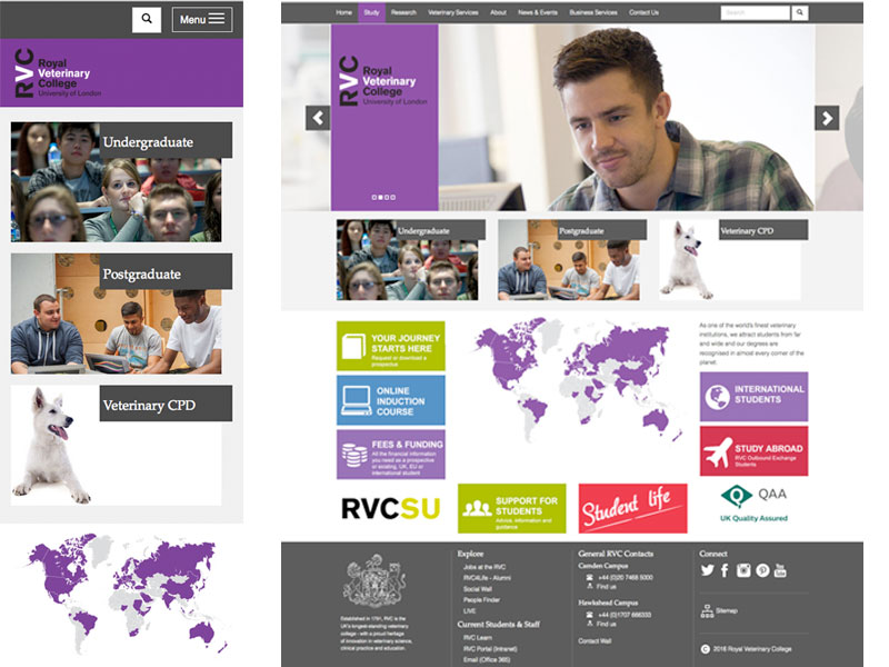
Thorough user testing and a numerious interations of the layout resulted in the current site. The example below is the final design of the study landing page.
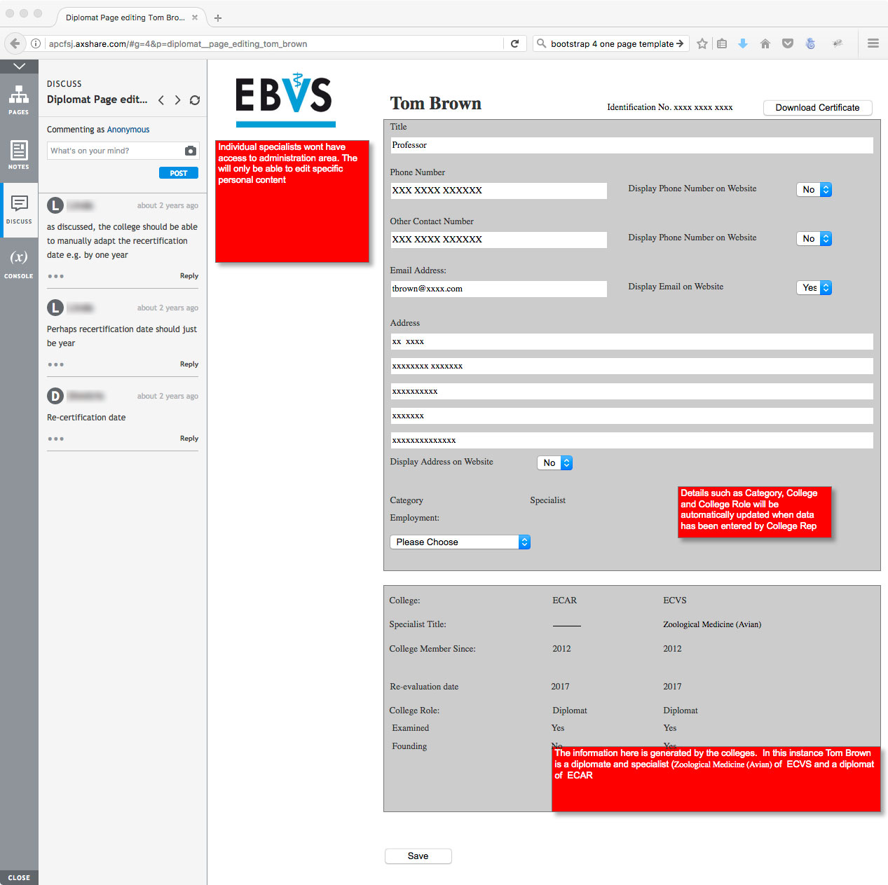
To create a bespoke content management system that administers and manages 35 distinct specialties and over 3300 specialists memberships. Additional to public access, the build required individual member access enabling updating of personal details and download printable PDF certificates of membership. Colleges automatically create and submit annual returns of college data for EBVS administrative and legal purposes.
This was a European Union project and due to its size and budget required it go to tender. I co-wrote the bid and pitched at the EBVS Annual General Meeting with over 70 delegates present.
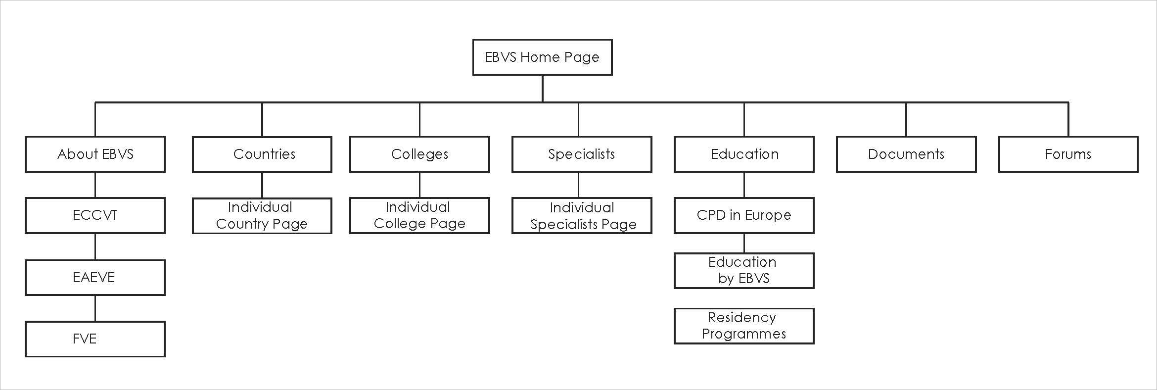
The Information Architecture from a public facing perspective was quite straight forward. A shallow navigation including:
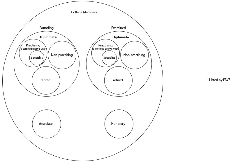
One of the biggest challenges of the IA was defining access and permissions for the various EBVS member types. With roles and access for standard diplomats, college representatives and EBVS administration varying significantly. After some early low fidility user testing it became apparent that the organisation itself was not clear of its exact type of membership roles as many of the process of the organization had previously been completed manually and roles and responsibilities were not documented. It was essential that membership types and access be defined before any start on the Dashboard Administration area.
From and administrative perspective we defined 3 types of user:
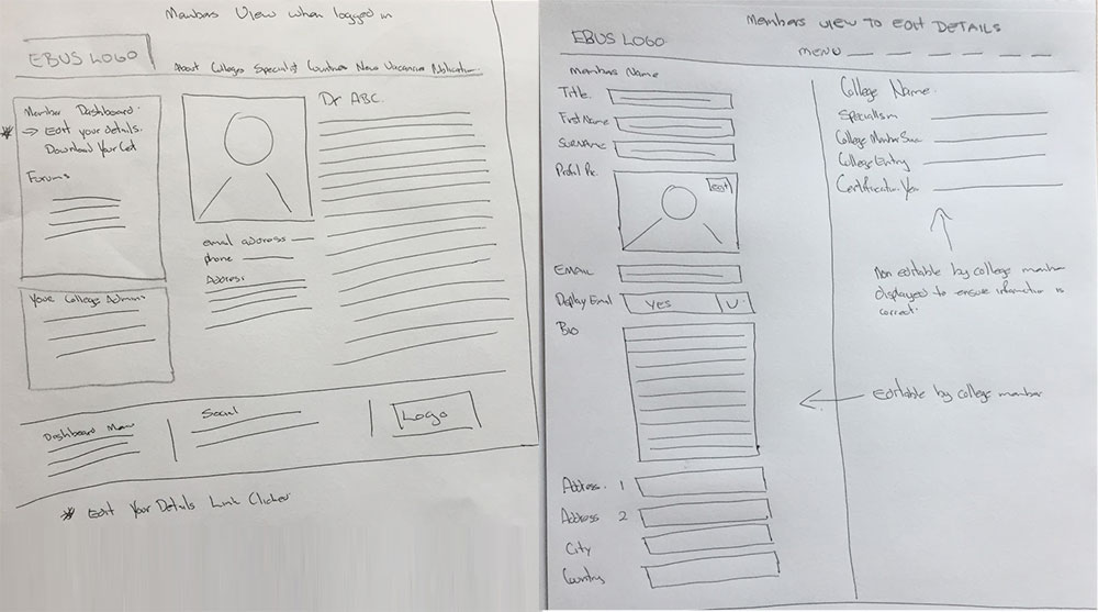
I developed initial hand drawn wireframes outlining funcitionality of the site.
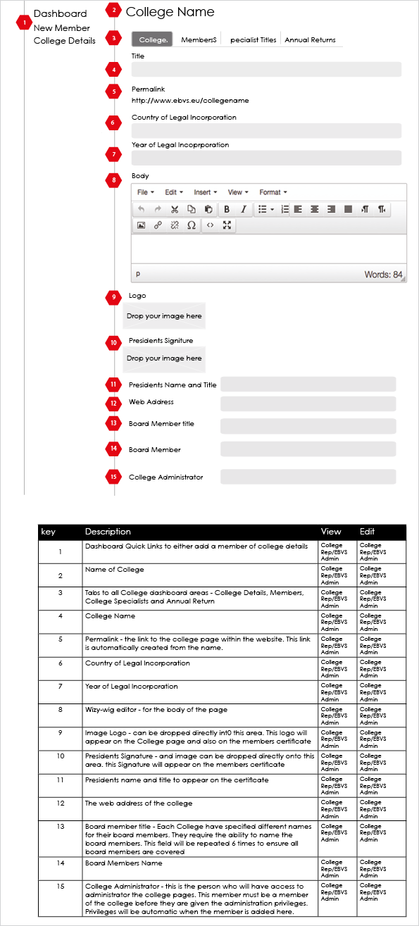
Wireframes were further refined in Illustrator.
Axure was ualised to create lo-fidility walk throughs. As the delegates of the organization spanned the European Union this was considered the best route to demonstrate the functionality of the product via a webinar. The notes functionality of Axure was enabled in the prototype for diplomats to make comments. Changes were suggested in the webinar which were rapidly implemented in the prototype. This ensured that we had a functional prototype and a sign off from the organization in short timeframes.
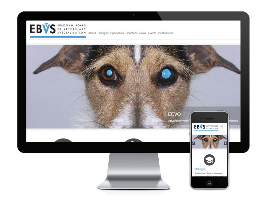
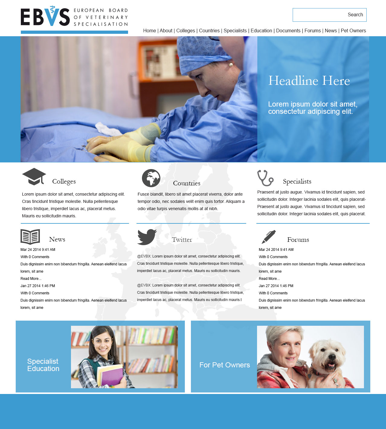
EBVS style guide were used to guide interface mocks for both phone and desktop views. User testing resulted in a number of iteration of screens being developed from the original wireframe. The example below shows one of the earlier home page mocks.
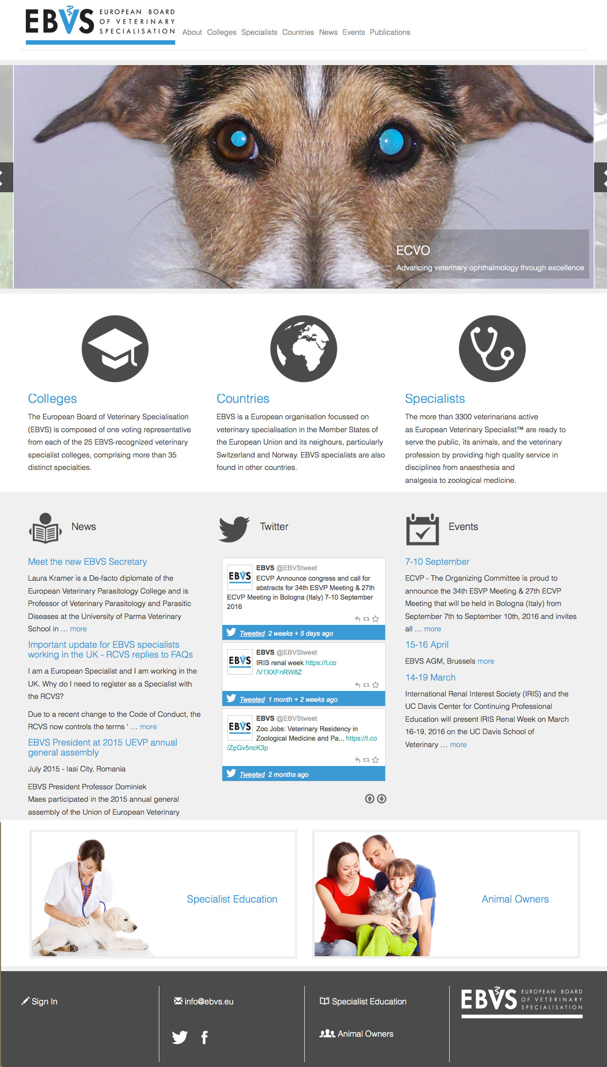
The example below shows is the final design of the landing page after numerious interations and user testing.
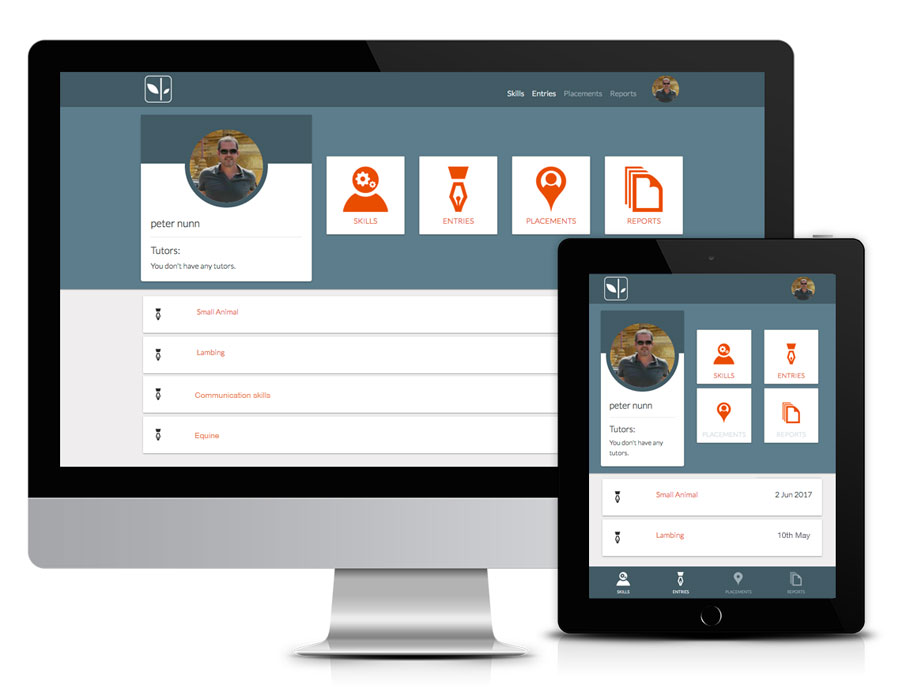
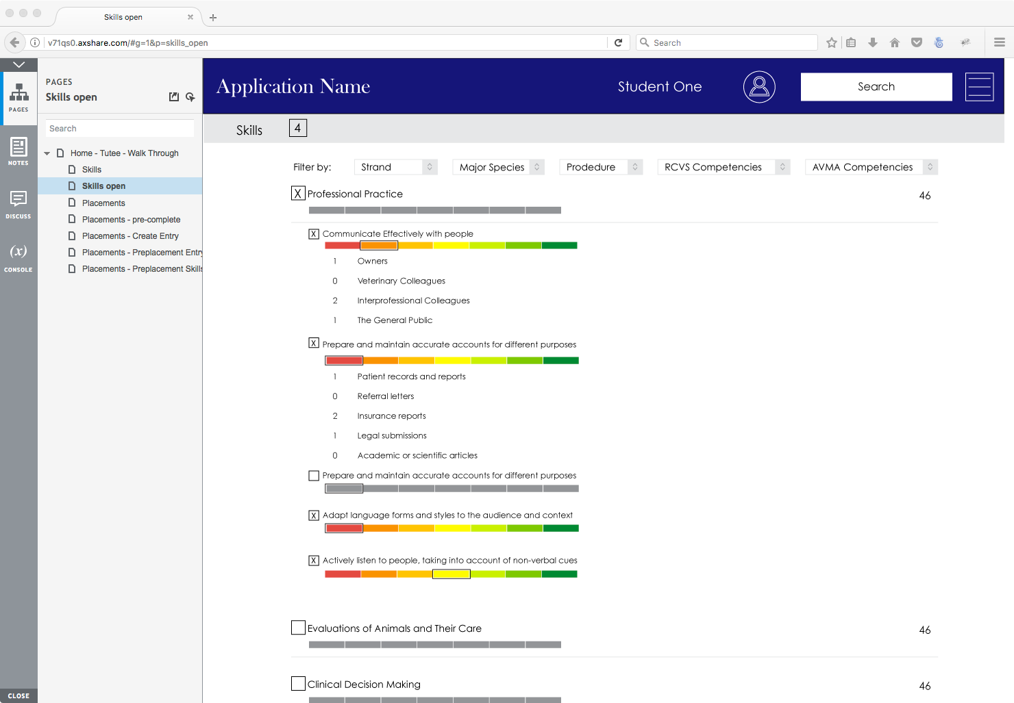
Folium is an online tool that helps individuals to maximize their learning and track their progress towards professional competency. This is achieved through skills logging, tutor supported placement planning and reflection, and through recording of and analysis of learning experiences throughout the course. The reporting function allows the organisations to monitor student progress, to review course outcomes and support course development.
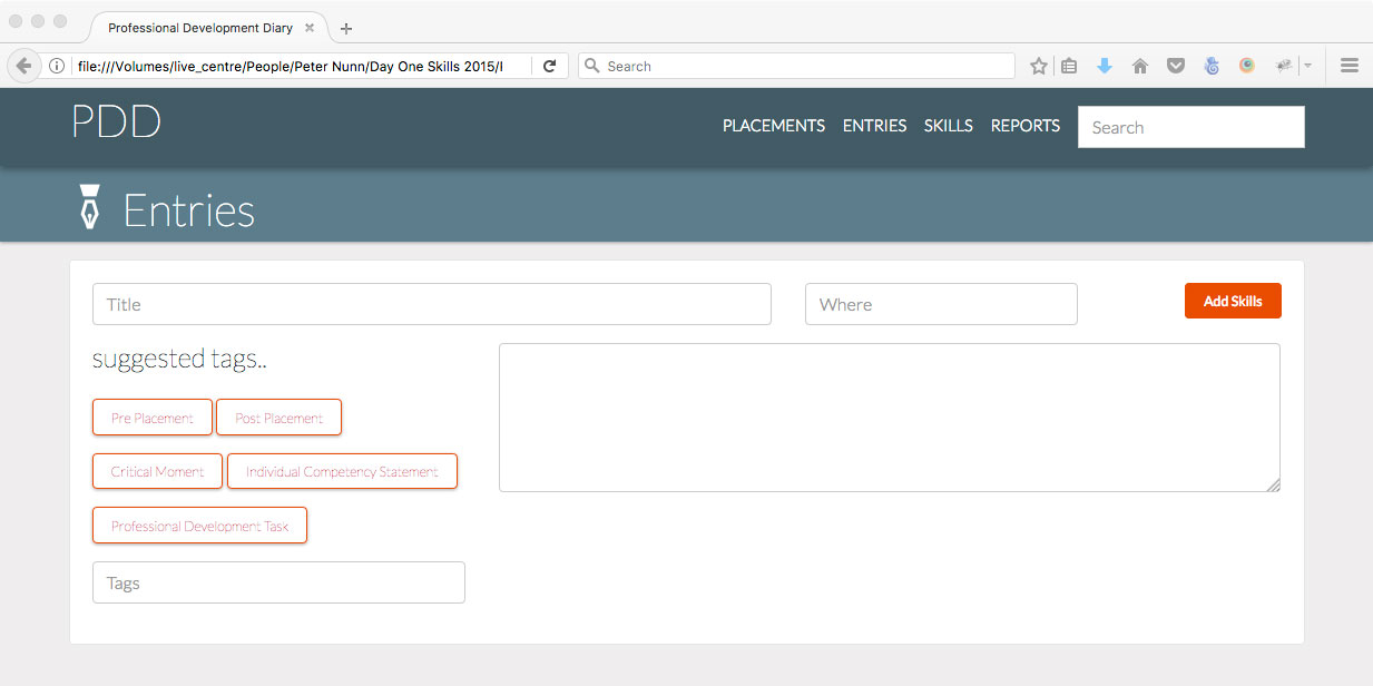
Folium in its original incarnation (Day One Skills Online) was developed in 2010 to address the issues of veterinary students achieving competence in their ‘Day One Skills’ by introducing an online logbook for students to record where and when they advance in a particular skill, enabling them to track their personal progress and to visually identify their ‘gaps’.
Over the years functionality was added to the product that was not initially conceived. In 2016 requirements outweighed the usability of the product. I approached senior management and academics and presented a case for the original product to be retired and a new application to be built from the ground up taking into account functionally introduced over its life with possible future requirements not yet identified.
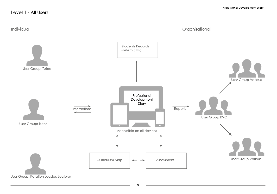
User research included interviews with students, tutors, course leaders and educational specialists. A wish list was gathered and the functionality was prioritised for development. Top level system maps were created to display broader concepts of information flow and function along with user persona, and user walkthroughs. Four main user groups were identified: Tutees, Tutors, Group Leaders and Organisational.
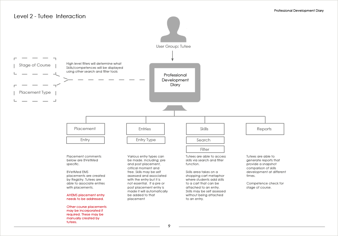
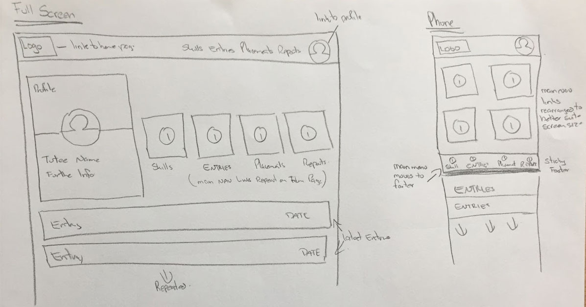
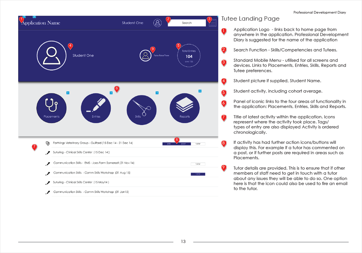
With site funcitionality being complex, the information architecture is shallow. The example below demostrates the IA for Tutee section.
Initial concepts were rapidly drawn in workshops and meetings ensuring all stakeholders were on the same page.
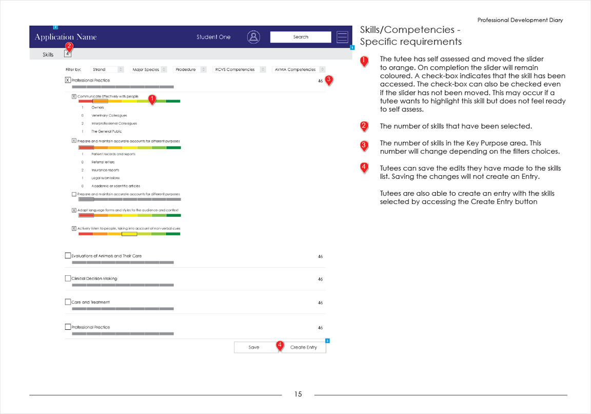
Low-fi wireframes were created in Illustrator. The wireframes were used for paperbase walkthroughs demonstrated to all user groups ensuring concepts were understood.
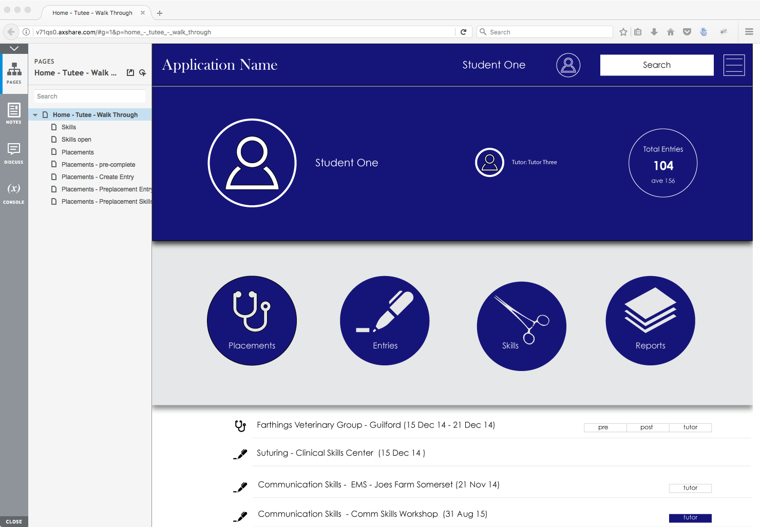
The wireframe were imported into Azure to create low fidelity walkthroughs.
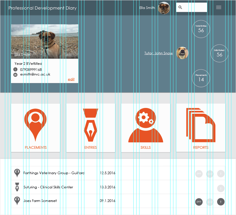
Initial screens were developed in Illustrator using a bootstrap gridded template to ensure even column for a responsive design.
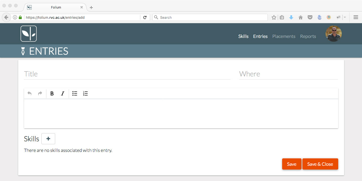
Initial pages for user testing were developed in HTML using Bootstap framework. Navigation and limited functionality were provided enabling stakeholders a clear understanding of the look and feel of product.
After a number of interations of the original screen the following evolved.
A number of different user testing methods have been used to this point. Initially task scenarios and observations with individuals were used to gain qualitative insights into any usability issues. Large group (60 people) task scenario’s were also used to test application on various devices. TurningPoint provided responses to various questions in a short space of time. User testing is ongoing.
Folium is still in development. A working version of Folium can be viewed here: http://folium.rvc.ac.uk . This instance of Folium has been created for Veterinary Students at the Royal Veterinary College. It is accessable via a Google logon. The Placements and Reports section are currently in development. Placements to be released by the end of June.
Folium has been created to ensure that any skills/competency list from any course or institute can be uploaded into the application.
Folium is an open source project.
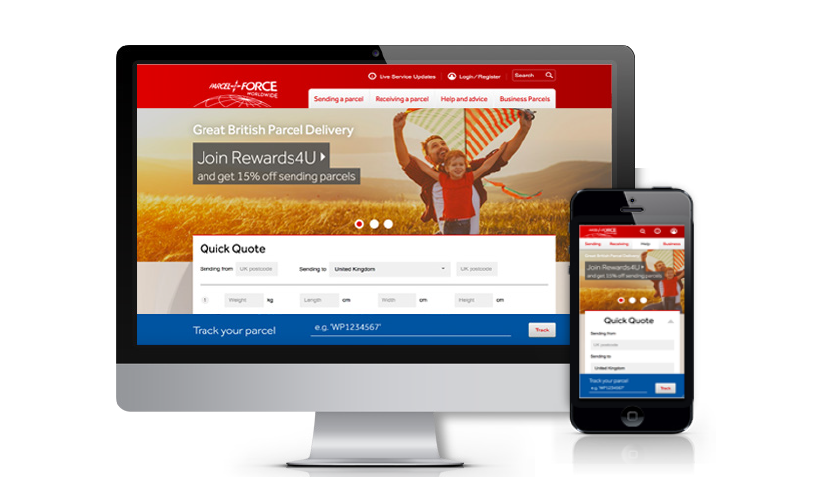
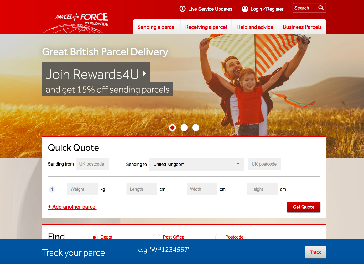
In 2013 Parcel Force redeveloped their website. The development included creating 2 sites, a desktop and mobile friendly. It soon became apparent that one responsive site was a better alternative to take. In 2018 I was the UX/UI designer tasked on the project to convert the existing site to a responsive.
The initial brief was to keep existing desktop graphical layout and adjust for smaller devices. After a number of alternative designs were presented to the clients it was decided that some pages including the home page would given a complete overhaul still taking into account the brand guidelines.
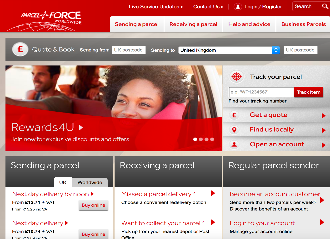
Early workshops also identified a number of UX issues that were taken into account when developing the site. For example the prominent placing of the 'Quick Quote' bar at the top of the screen and the 'Track Your Parcel' sticky footer at the bottom of the screen
The original screen
Responsive Screen
Sketch and Invision were used to create screens and present a clickable prototype to the product owner.
The process taken at Capgemini for the project was Agile scrum. JIRA was used to track the project. I was required to attend morning standups with other team members, the testing team being located in India. We had weekly meetings with the project owner both online and face-to-face. Sprint planning and spint retrospective were every 2 weeks.
As the project was completed under budget. I was also tasked with converting bitmap icons and backgrounds to vector. For this I used Adobe Illustrator.
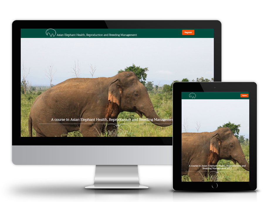
This original project started in 2009 and had a major software update and redevelopment in 2017. The original brief was to develop an international training course on the management of the health, reproduction, breeding and welfare of Asian elephants. After 7 successful years of delivery funding was secured to update the promotional site and the learning platform
Working with world specialists I was required to put toghether pedagogically sound learning materials taking into account that for a majority of participants English would not be their first language. Because of language issues we decided to rely heavily on video and images content within the lessons. I was required to travel to Sri Lanka and Thailand to gather both video and image assets for lessons.
The original theme in Moodle was developed before responsive design was even considered. With an upgrade to the latest version of Moodle a new theme was deemed necessary to ensure that the materials could be viewed on all devices and platforms. I was required to design and develop this theme. I used the Bootstrap framework as the basis for the theme and was required to use my skills in HTML and SCSS throughout the development.
Taking aspects of the original information page and the registration form I designed and developed the landing/registration page.
Original images that we had taken in Sri Lanka and Thailand were used for the graphical elements of this page.
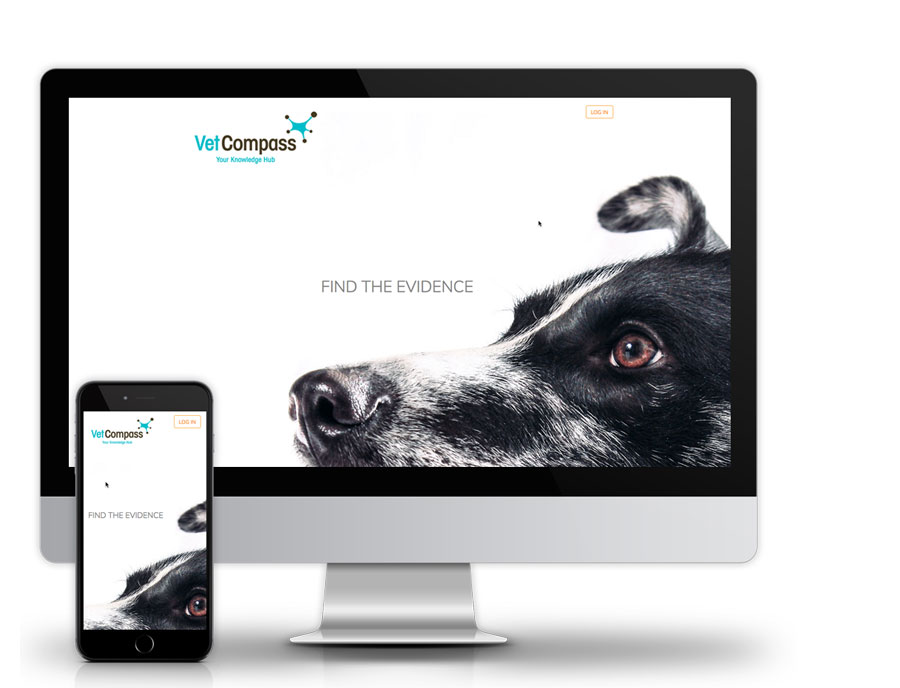
The VetCompass Search Engine is a tool developed for veterinary researchers. It indexes millions of clinical records collected from primary practices and referral centres. Researchers use these records to create an evidence-base. The evidence is used by vets to improve the health and welfare of animals.
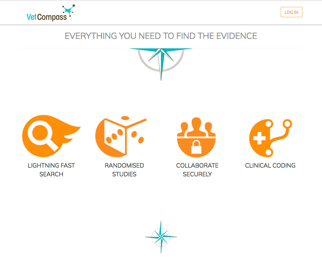
For this project, I was presented with a 3 page word document and asked to create a promotional/logon page for the project. I worked with project leads in refining content. A Single Page Application approach was used. Stock images were utalised for graphical elements. I created all iconic and vector elements on the page in Illustrator.
The project was a result of Brexit. A number or processes within the Veterinary Medicines Directorate are managed by a central European body. On leaving the European Union these processes will need to be managed within the UK.
These processes revolve around reporting and registering drugs and medicines fit for use within the UK. At the time of the project the administration was managed via a number of smart PDF’s some of which were over 15 years old and having over 160 fields to fill.
My role in this project was to design a user experience and interface that gathered the same information as the original forms.
One major requirement here was that whatever the end result it must adhere to Government Digital Services Guidelines. https://www.gov.uk/service-manual
The project team here consisted of 3 designers, 8 developers, 5 testers, 3 businesses’ analysists and one srum master. We had daily stand ups, a retrospective and planning meeting every 2 weeks, a show and tell every week along with extensive workshops.
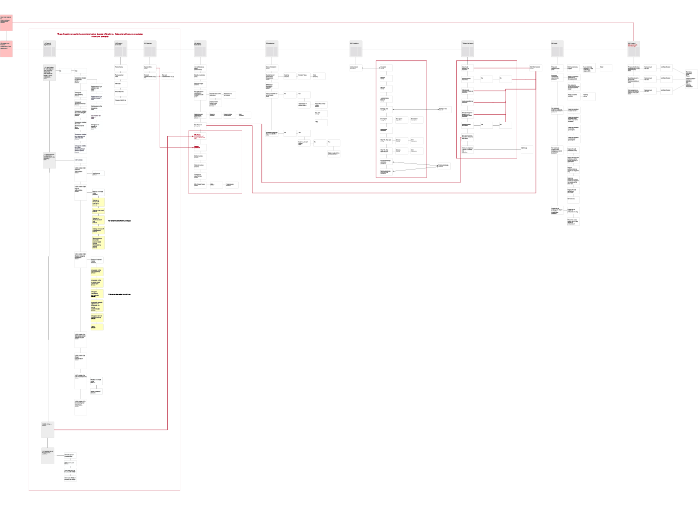
I held a number of initial workshops with product owners to establish requirements. These workshops resulted in taking the original document, stripping it back to basics and filtering essential information. Card sorting exercise were used to create a user flow. The result of these exercise were design flow charts created in Omnigraffle. Omnigraffle was chose due to the complexity of the information flow.
Omnigraffle user flow diagram. This has deliberately been left in a state that is not readable to protect confidentially.
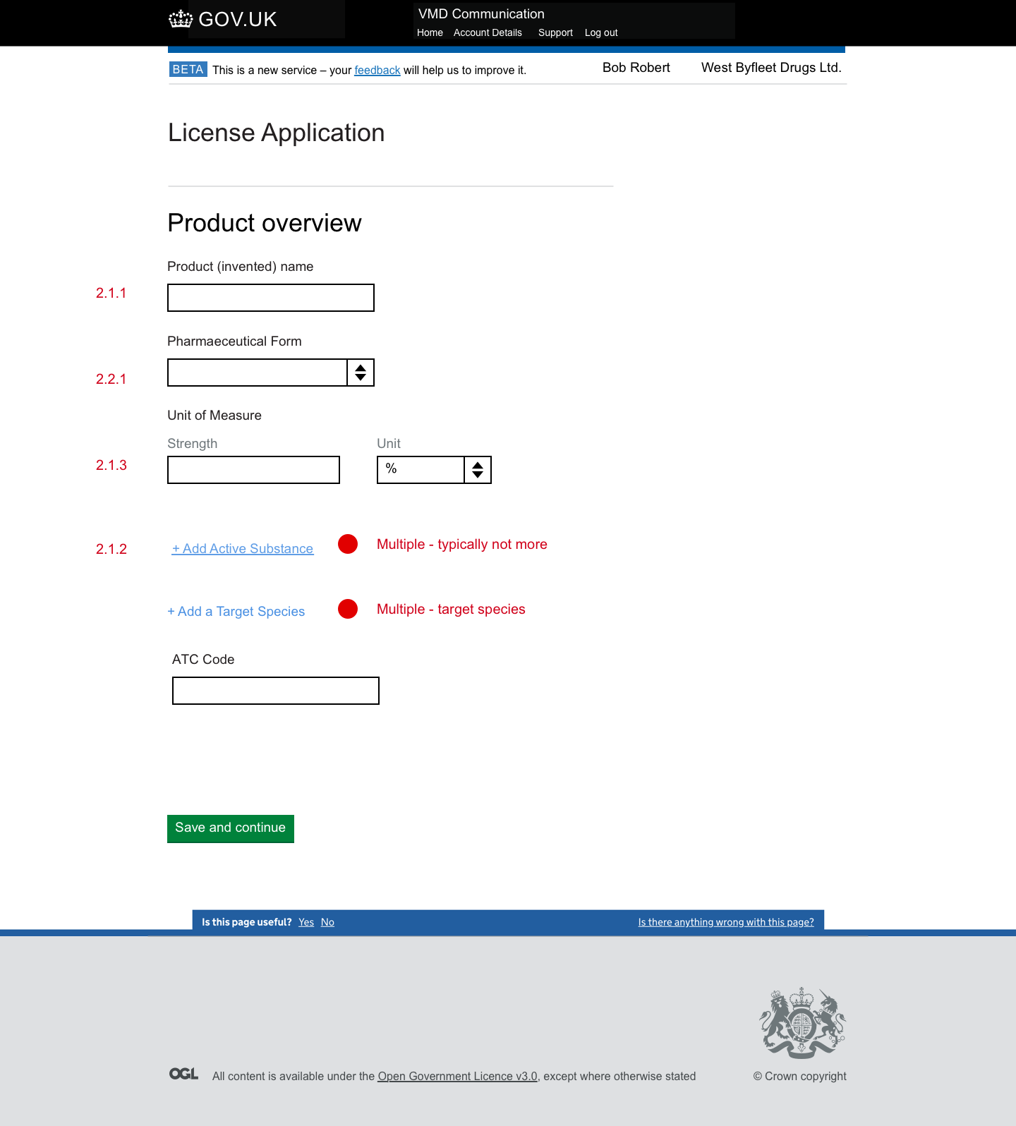
Once user flow was determined screens were created in Invision implementing GDS design patterns. One major hurdle we had to overcome here was GDS guidelines state that JavaScript is only to be used to enhance the user experience and cannot be used in the most basic iteration of the product. In cases were multiple entries may be required within one field. being limited to no JavaScript was a major pain point. Collaborating with developers we designed a solution that involved a looping flow to another page where data was recorded in cache. The loop back to the page adding each additional field.
Because Invison is not hosted within the UK Data Protection would not allow a typical Invision prototype build. In this case I was required to build a complete html working prototype using the GDS prototyping kit - https://govuk-prototype-kit.herokuapp.com/docs. The prototype was uploaded to https://www.heroku.com/ for testing purposes.
The working html prototype also helped ensure that we passed the stingent GDA assessment.
Testing was conducted with a number of typical users both online and face-to-face. I was required to write test scripts and conduct testing sessions. Users were required to complete the form using data that had previously been submitted. Testing resulted in a number of iterations of the final product.
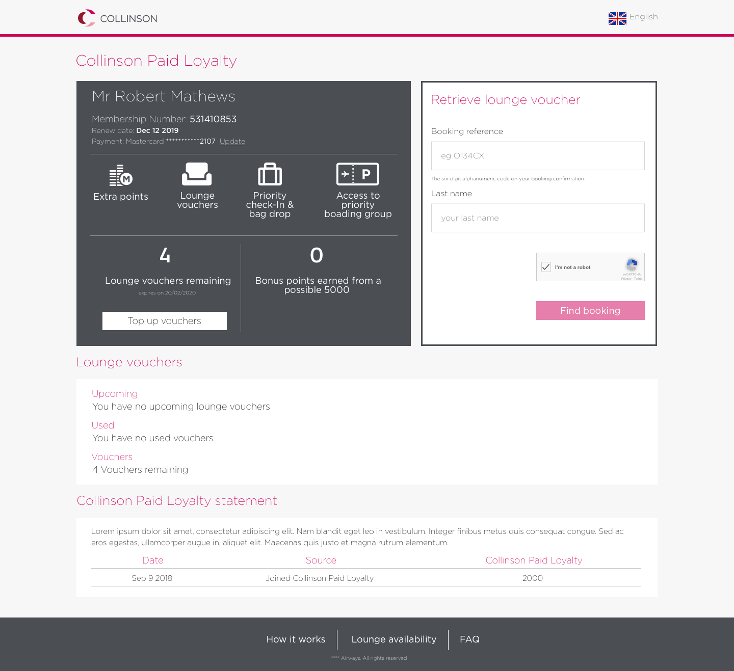
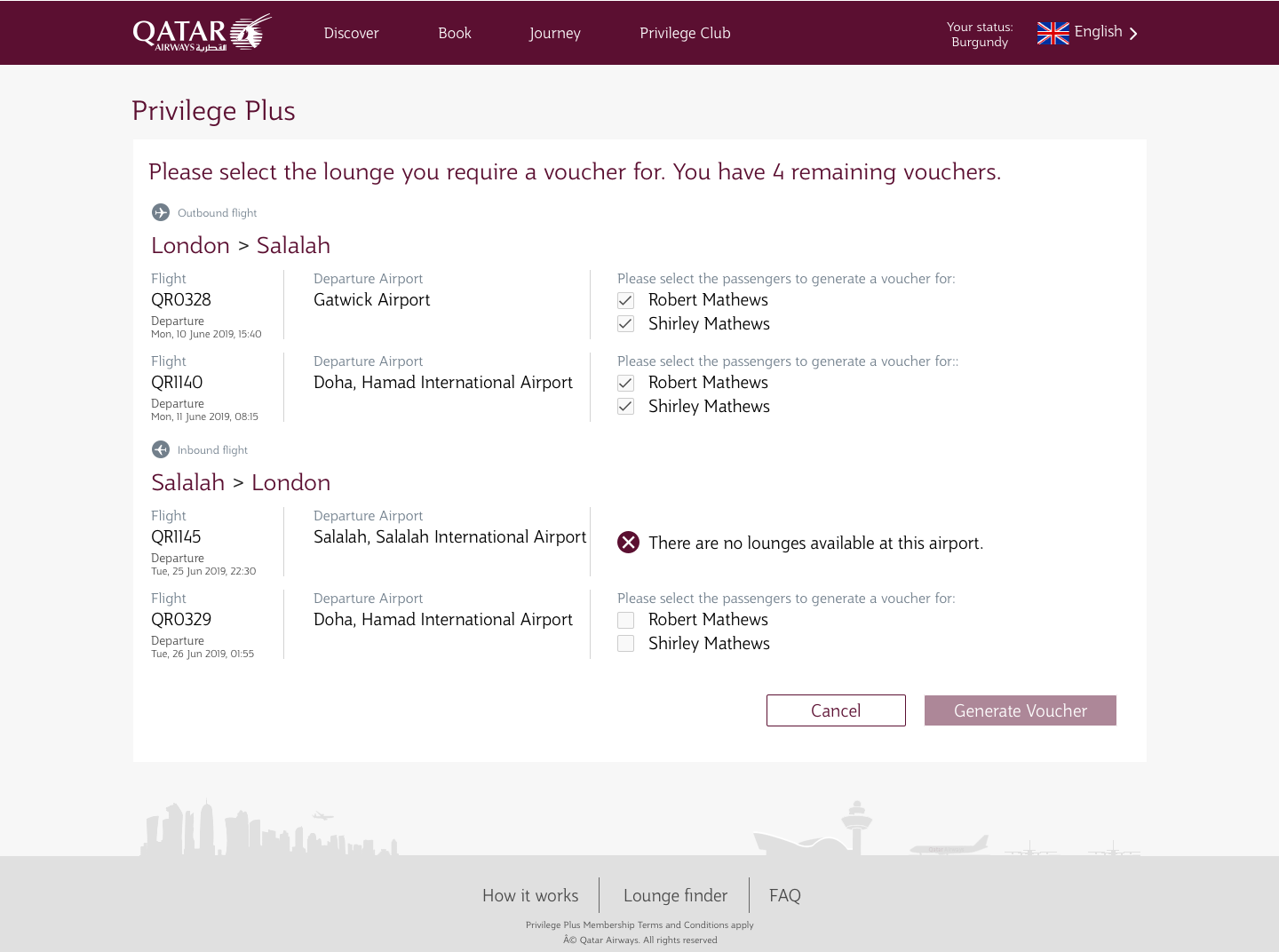
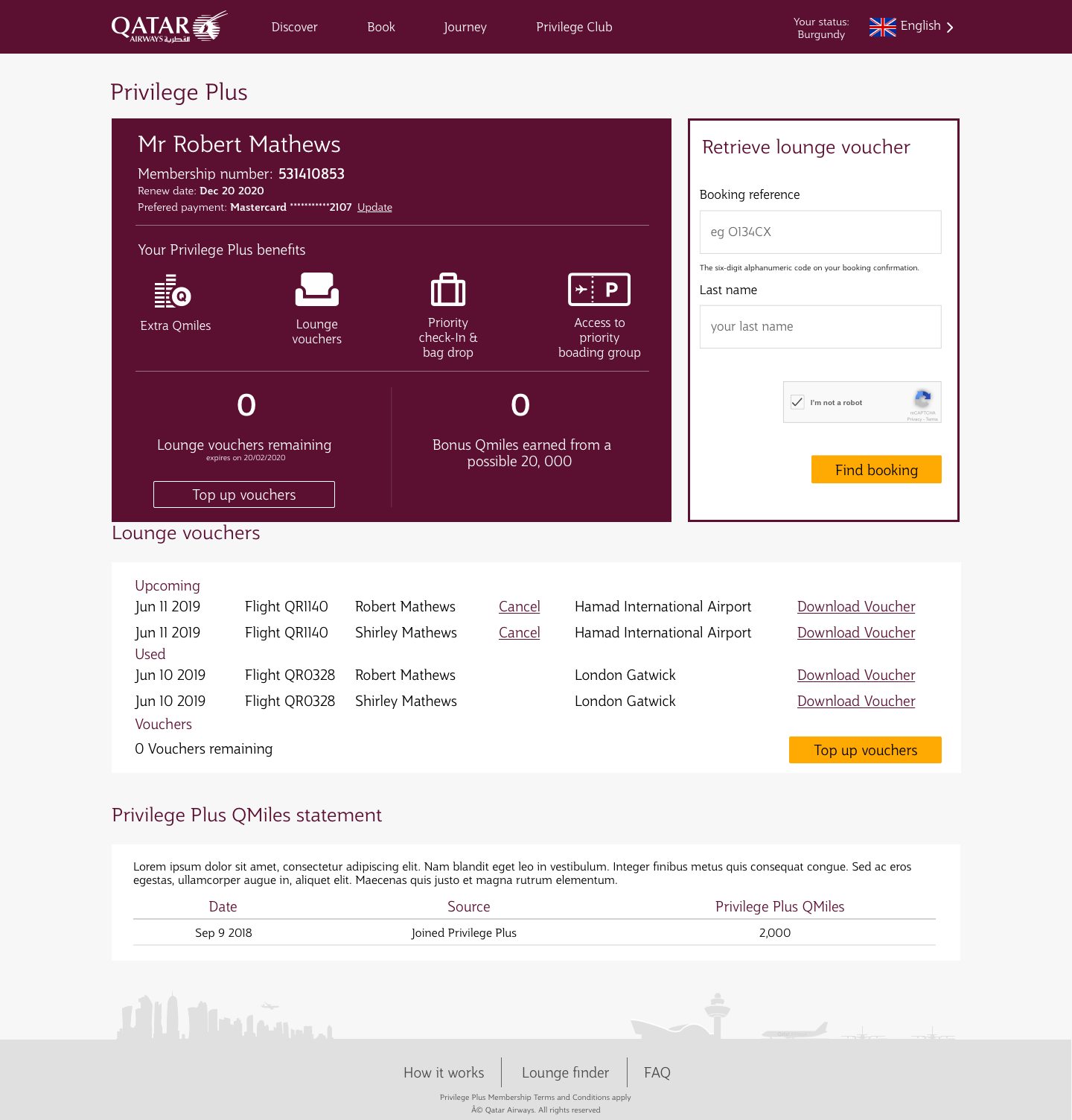
QATAR paid loyalty is a concept developed in partnership with Collinson Group and QATAR Airways. QATAR Airways has a 4-tiered membership Privilege Club. The paid loyalty concept was created to provide extra benefits to the lower level tier. It enables members to purchase extra benefits such a lounge access in QATAR sponsored lounges and a fasters boarding experience.
Discovery phase workshops were held with the product owner, business analysist and lead developer. This workshop resulted in user user jouney diagram created in Lucidchart.
A white lable product was produced first with Collinson branding. Wireframes were created in Sketch and screens were uploaded to Invison for prototyping and testing.
Initial user testing utilised https://preely.com/. Screens were imported from Invision. A number of tasks were identified for users to be able to complete. At the end of each task users were asked questions pertinent to the task.
Finally QATAR branding was applied to the white lable product for further user testing and client approval.
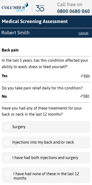
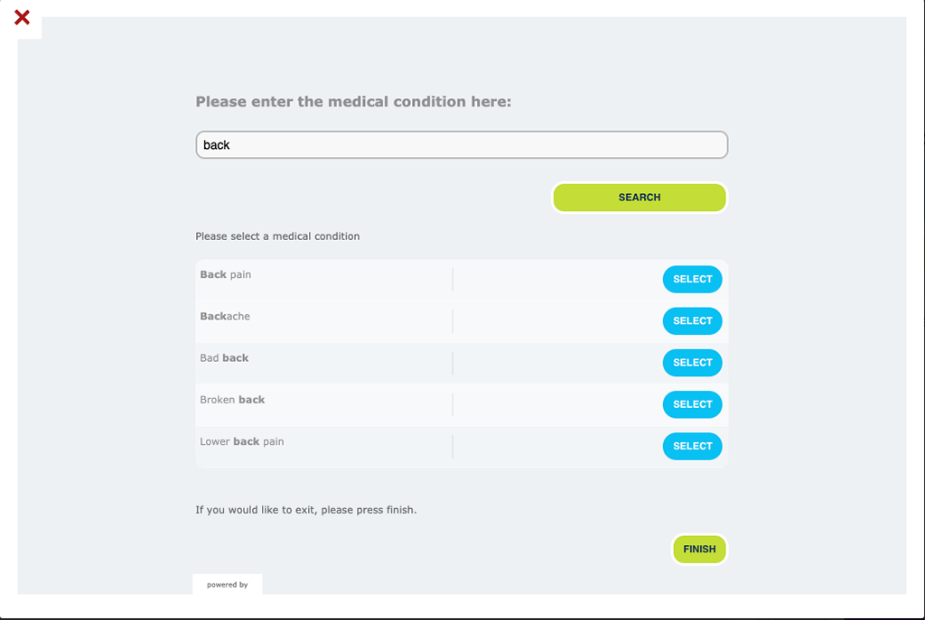
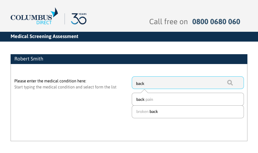
Google Analytics highlighted a major dropout rate with insurance signup on mobile devices. For this project I was required to review the current signup journey and provide alternative suggestions based on the results of user testing (observational and interviews) a comparative analysis and implementing best UI best practice.
Results of user testing idendified the following areas:
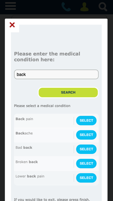
The original screen in a pop up window. No branding. Extensive padding reducing screen real estate. Search button required to produce search results.
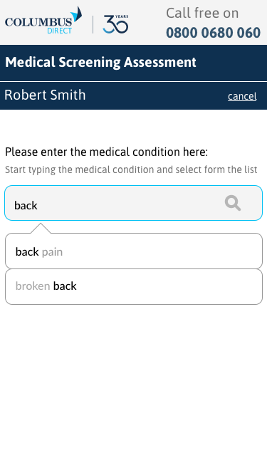
Suggested screen with compnay branding, reduced padding extending screen real estate. Auto-compete search results.
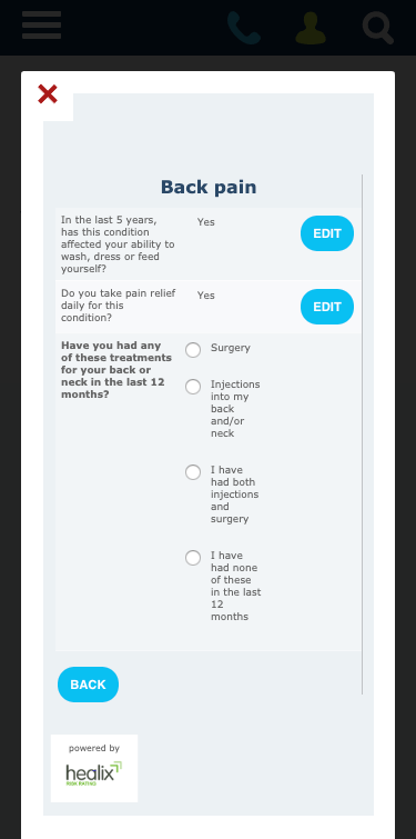
The original screen with two coumns and narrow bullet labels.
Alternative layout with single column.
The following is a desktop versions of the search shown above
Original Search
Sugested Search Screen
CVS is the largest integrated veterinary services provider in the UK. It has over 500 veterinary surgeries spanning the UK, Netherlands and The Republic of Ireland. It also operates laboratories and pet crematoria. CVS provides extensive inhouse training and continuing professional development for all of its staff including veterinary, scientific and support.
For this project I was contracted to lead a team to design the experience of users within the company accessing the learning platform.
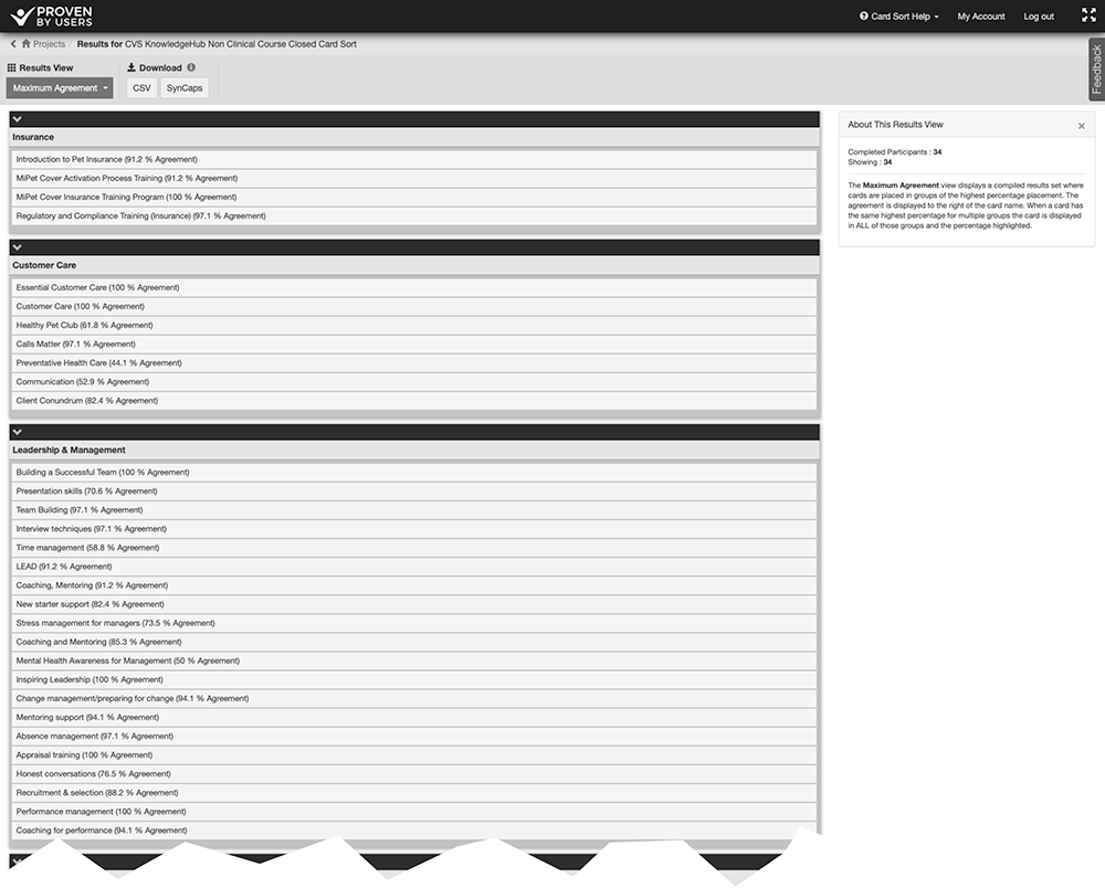
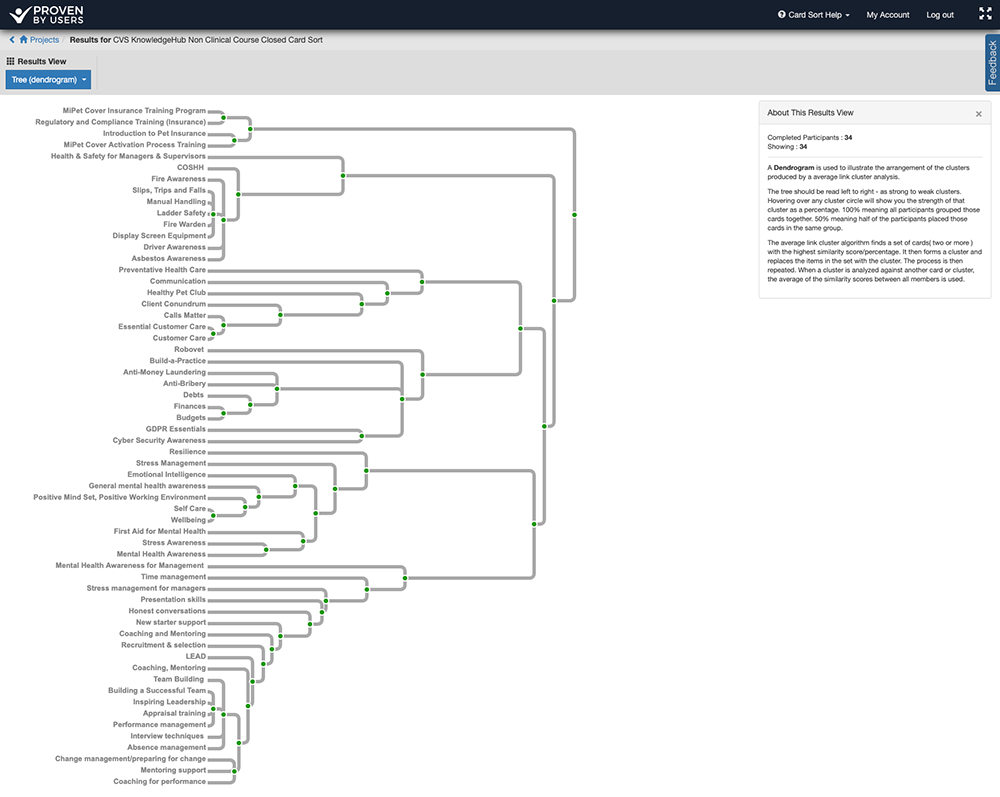
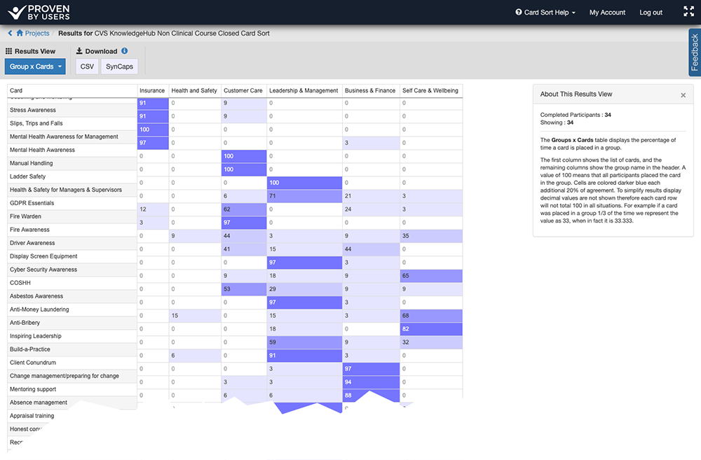
At the start of the project CVS had over 100 clinical and non-clinical courses with no logical hierarchy or grouping for end uses to be able to identifiy or find appropriate courses. Using Proven by Users I created and ran a number of card sorting exercises. The first was an open card sort to identify groups. These groups were later tested in a closed card sort.
Maximum agreement results for closed card sort
Dendrogram
Groups and agreements
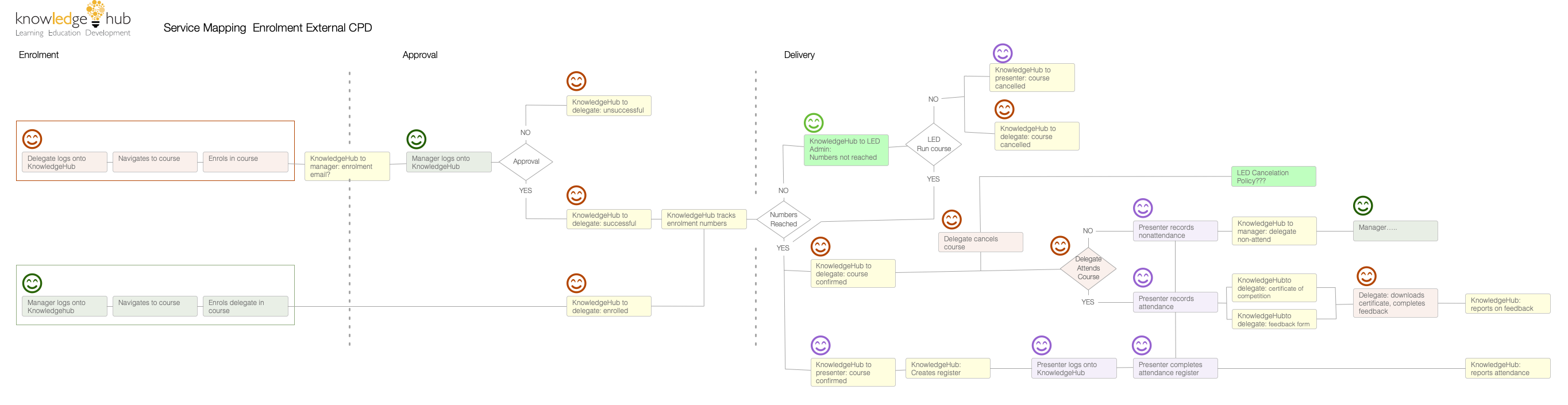
Courses within CVS are delivered in a number of ways; face-to-face, fully online and blended. One major requirement was the ability for users to be able to book any face-to-face attendance through the platform. I ran workshops with users including administration staff tasked with organising workshops, end users wishing to book workshops and management staff requiring reporting. It became evident that the process here was quite complex requiring multiple notifications both to admin staff and end users. A service design was initially created in OmniGraffle.
CVS KnowledgeHub Course Booking Service Design
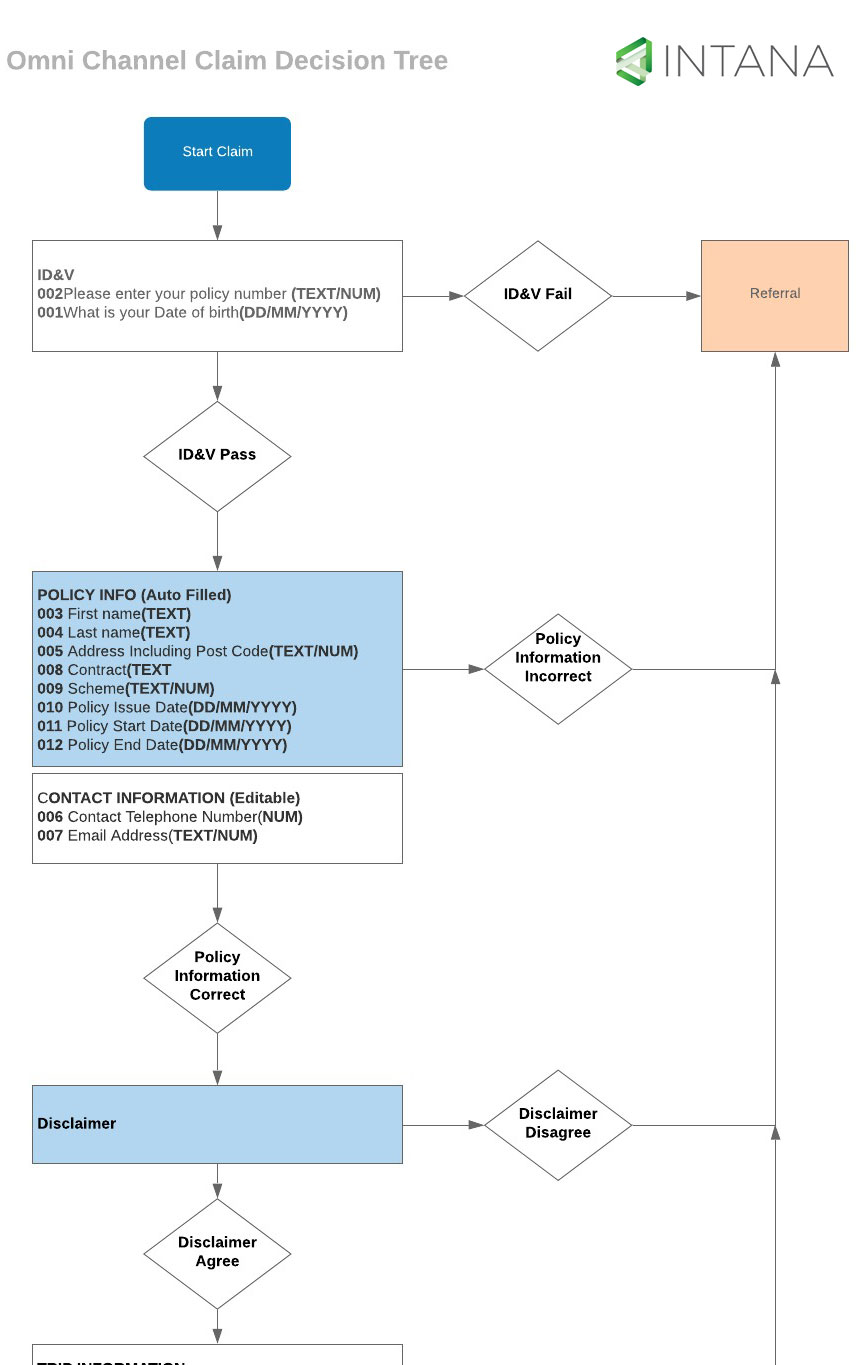
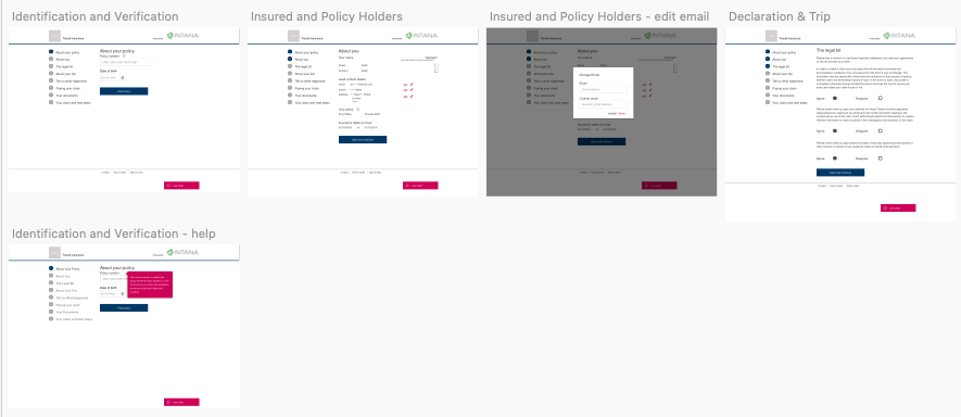
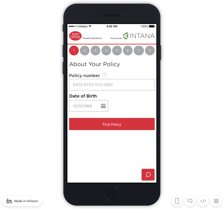
Intana provide Assistance and Claims Management services for insurers and brokers around the world. For this project I was required to design the insurance claims customer journey for the online touchpoint of this omni channel experience. The product is white label with partners including EasyJet, Post Office, Vhi and Saga.
Discovery phase workshops were held with the insurance experts and business analysist. The online channel journey was mapped. This journey included decision points directing users to other channels when necessary.
Low fidelity screens were developed in Sketch and uploaded to Invision. Preely was used for remote testing purposes.
Hi Fidelity screens were uploaded to Invision with branding for partner approval.
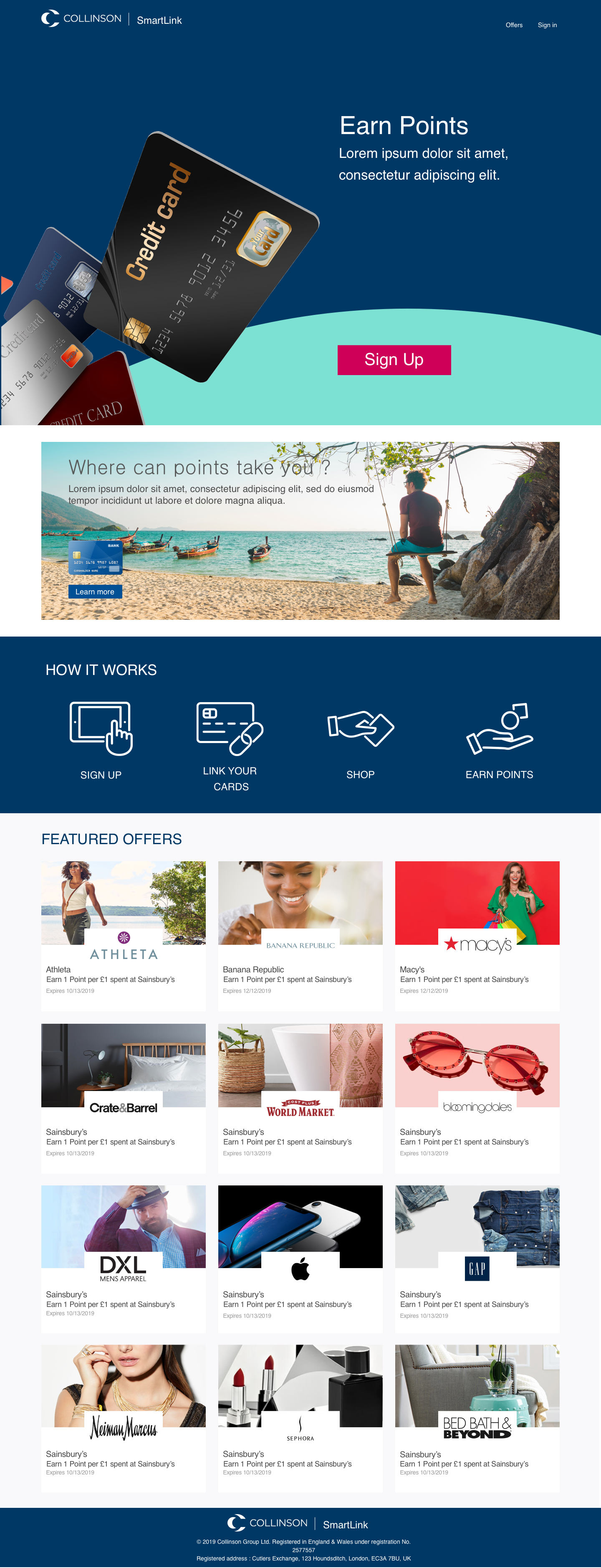
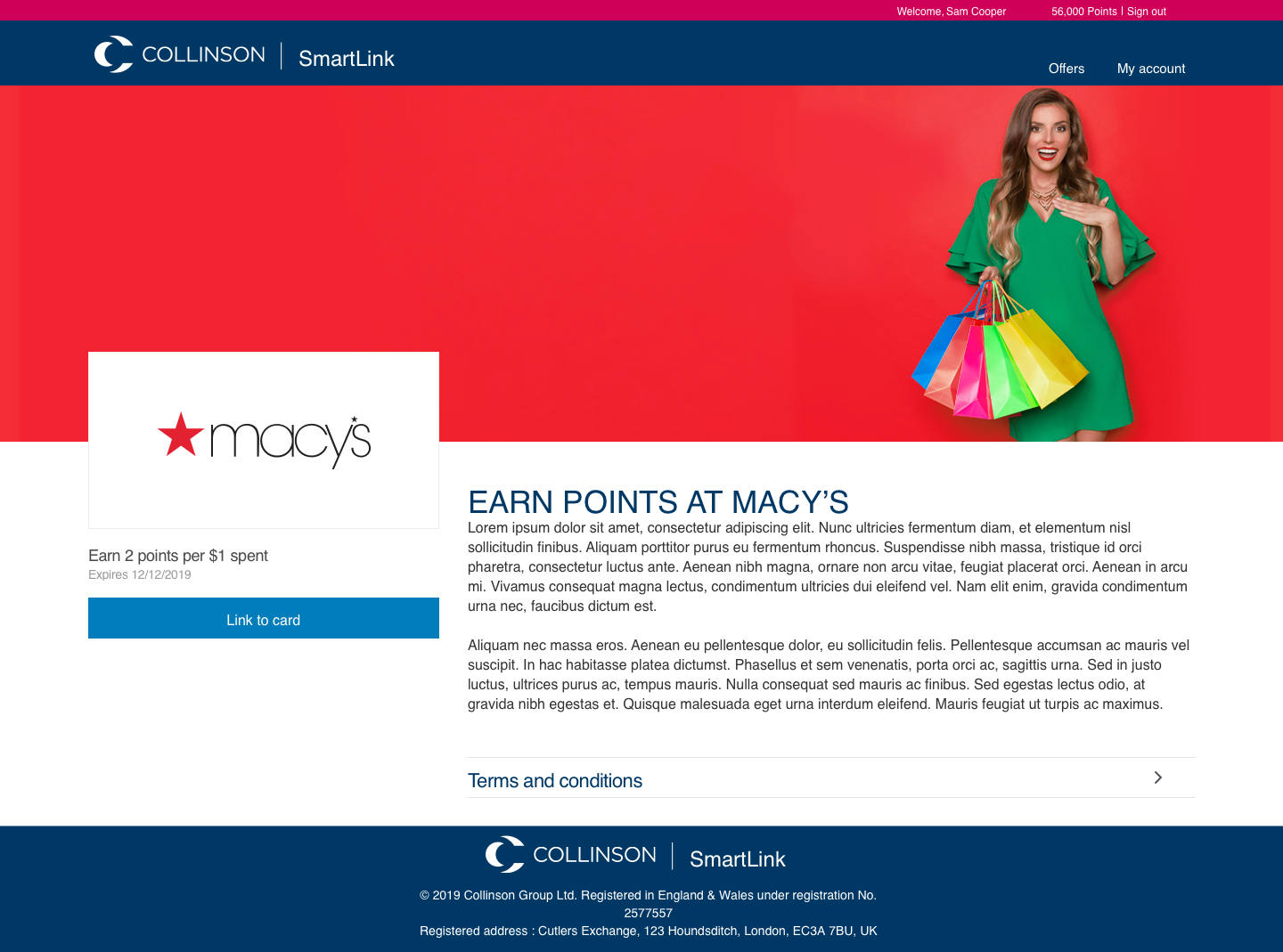
SmartLink Offers is rewards program aimed at hotels, financial institutions, airlines and other businesses linking credit cards for both online and instore purchases improving customer engagement. Collinson has a long history of rewards programs and the aim of this project was to create a contemporary product using technology to fully engage customers.
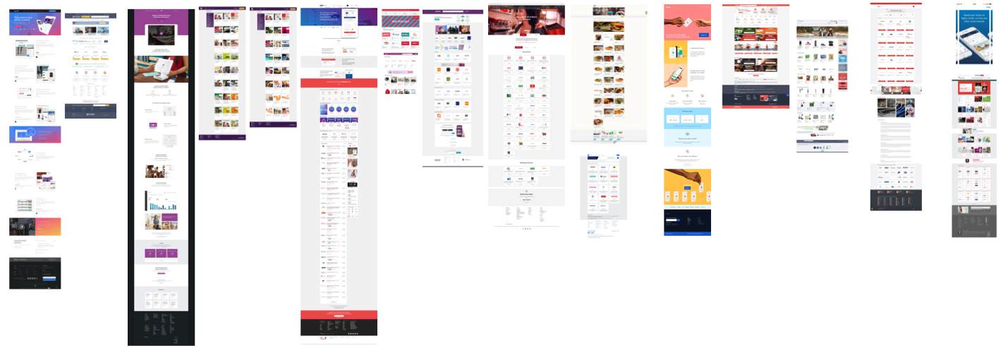
A competitor analysis was performed evaluating user interface and journeys of other reward programs including the signup journey. This helped provide direction for the look, feel and experience of the product.
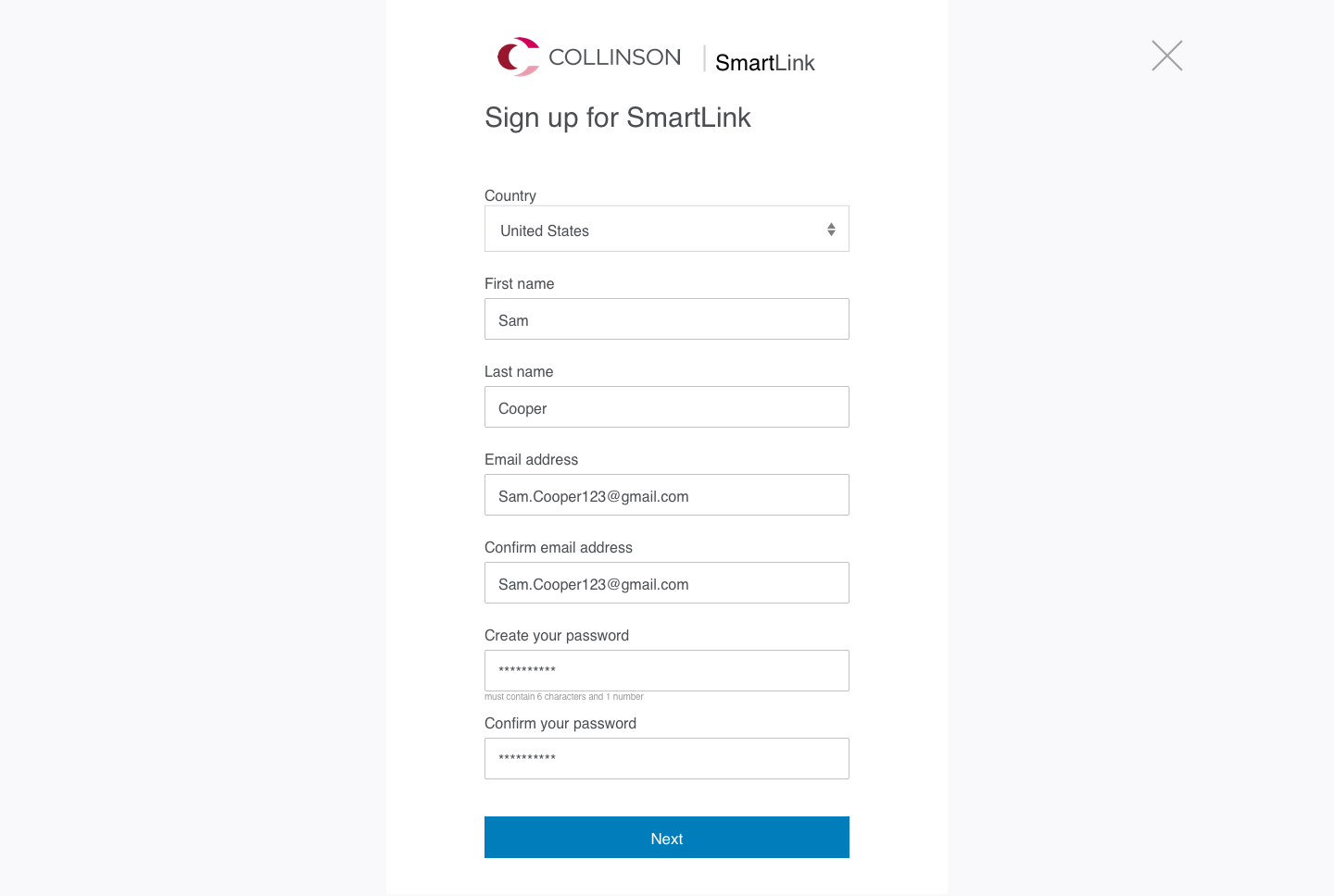
UX best practice and the competitor analysis identified a sign up journey that:
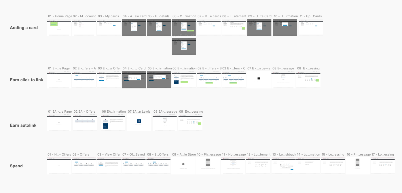
User journeys were mapped using Sketch
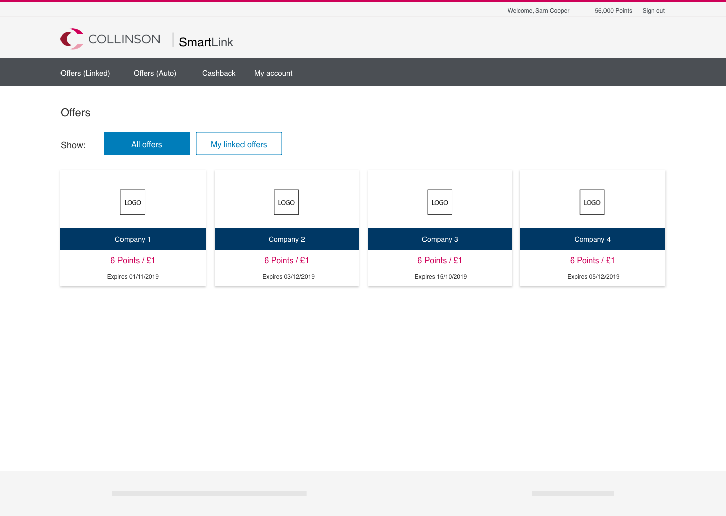
Low fidelity screens were created.
Preely was used for remote testing purposes. Remote testing identified some minor issues with linking credit cards to the account. To address this an option to add a credit card in the sign up process was included.
Hi Fidelity screeens were created using Collinson branding. Sreens were uploaded and prototype created in Invision.
Fully Responsive - Mobile View
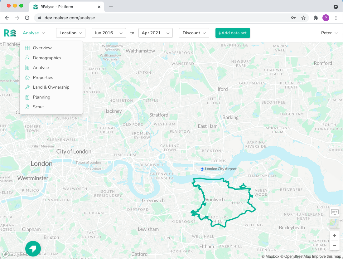
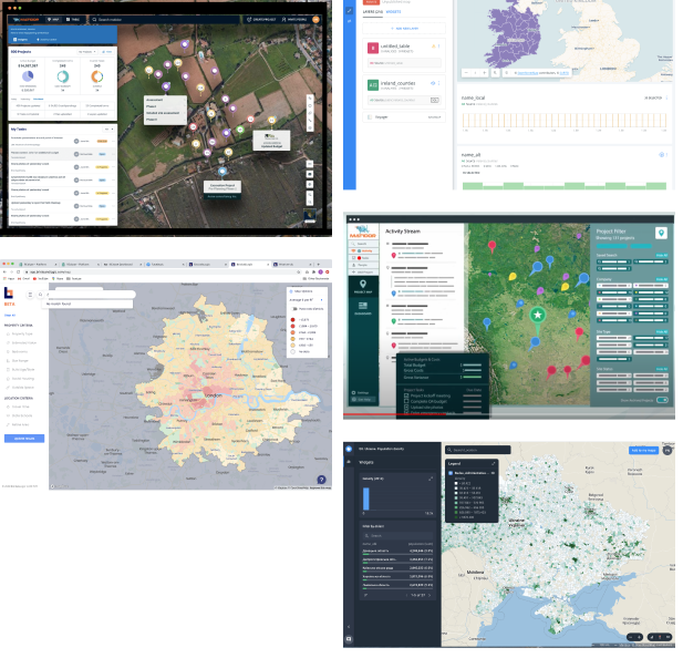
REalyse is an application that brings together multiple datasets on residential property and presents it through easy to use analytics tools for property investors, lenders and developers in the UK residential property market. The application includes geo special drawing tools, big data visualisations and custom dashboard design.
This project is a re-build of an existing platform from the ground up. I was hired as the Senior UX/UI designer to evaluate the usability of the existing platform and oversee the redesign of the new. The design team consisted of myself and a junior designer.
In this project I was lead designer and had input into all phases of the design cycle. Taking the project from end to end. This example looks at 7 phases of the design cycle:
A full audit and review of the old platform was performed. This identified a number of usability issues.
A competitor analysis was performed. Not having any benchmark platform this analysis was performed on a variety of platforms that utalised geospatial applicaiton and large data visualisations
A number of user types and personas were created identifying their current journeys within the residential property market and how they utilised the current application.
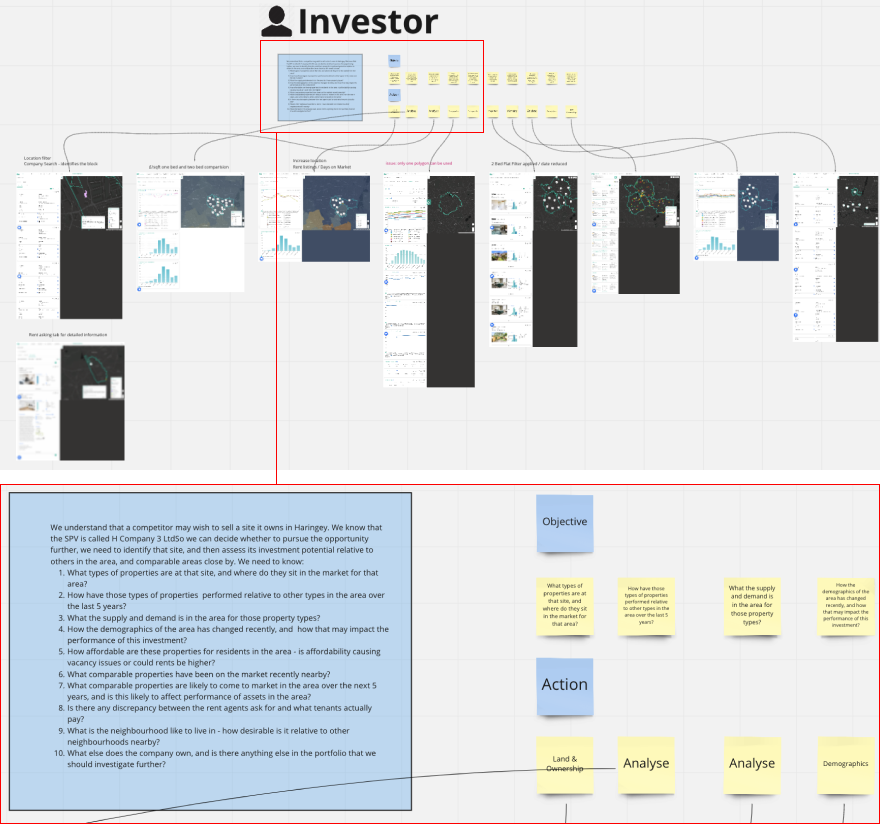
Earlier in the process a number of broad issues were identified along with some proposed solutions including:
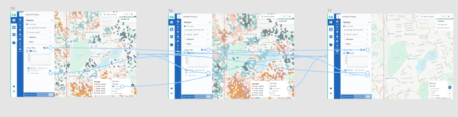
Low fidelity screens were created helping visualise, test and validate the proposed solutions before any code was written.
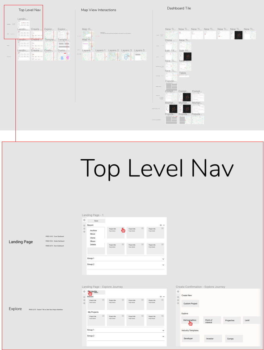
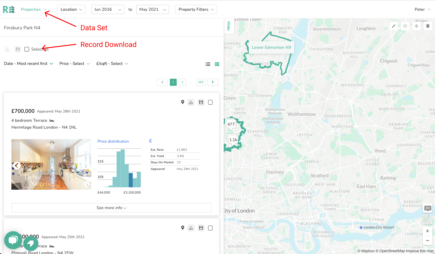
Low fi wireframes were translated to hi fi wireframes for prototyping and testing purposes.
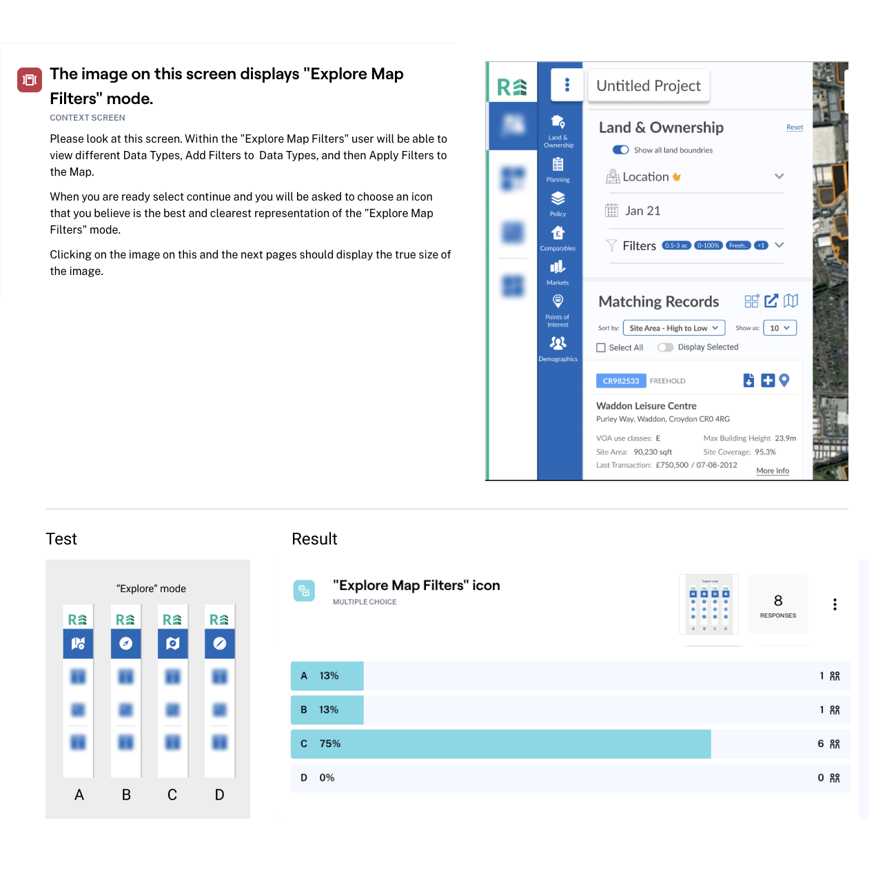
Identifying appropriate icons for an application with such a specific user was critical considering the number of icons to be displayed on screen concurrently. Various libraries were accessed including Font Awesome and The Noun Project, some icons were also custom created. The choice of icons was validated via Maze testing. In the test icons were placed in context on screen and users were asked to choose which icon they most associated with the given task.
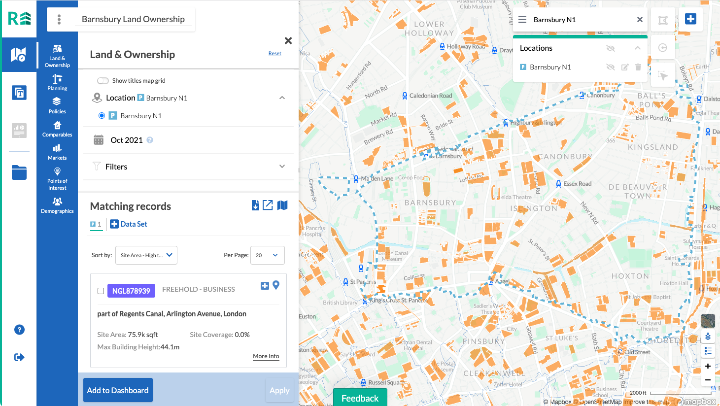
One of the main tools in the application that changed significantly after many iterations was the geospatial drawing tools.
The location first approach presented a number of challenges. The main being that user wanted the ability to draw their own polygon shapes on maps in addition to being able to select pre-defined polygon locations. This required providing users with drawing tools in addition to location search. It was decided that because of the location first approach, search and drawing tools should be available on screen at all times.Users can build a location list by searching for a location and also drawing custom locations. Working closely with geospatial specialists and developers a number of drawing tools were identified, including:
Initial access to the drawing tools was provided to enable continued development of the platform. Initial user testing identified a number of issues with this approach. Primarily saving the location to the location list.
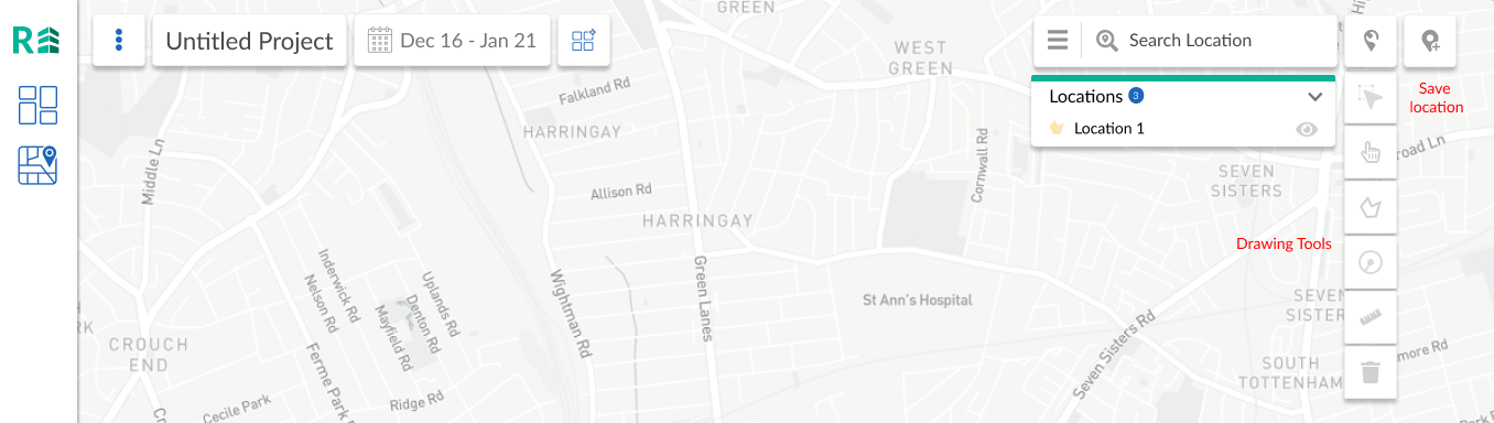
Many iterations on these tools resulted the complete rework of the save location tool and adding a draft location in the location list with the option to save or cancel. This provided users with a much clearer journey when creating locations.

The RAITT (Radical Architecture IT Transformation ) is a strategic plan to gain market advantage and to launch a range of new offerings including 5G products and services. The core of RAITT is to make O2 Telefonica a truly online convergent and omnichannel digital champion with fully automated process flows, zero back-office interactions, continuous agile development, maintenance, deployment and operations.
My role in this program was that of lead with a team based in UK, Europe, and India. The project required the design of multiple user experiences (B2B and B2C customers ) for an omni-channel, white label product. The solution needed to support the requirements of all current brands including: O2, Blau, Ay Yildiz, Ortel Mobile, Fonic netzclub, Aldi Talk NettoKOM, 1&1, Tchibo, WhatsApp.
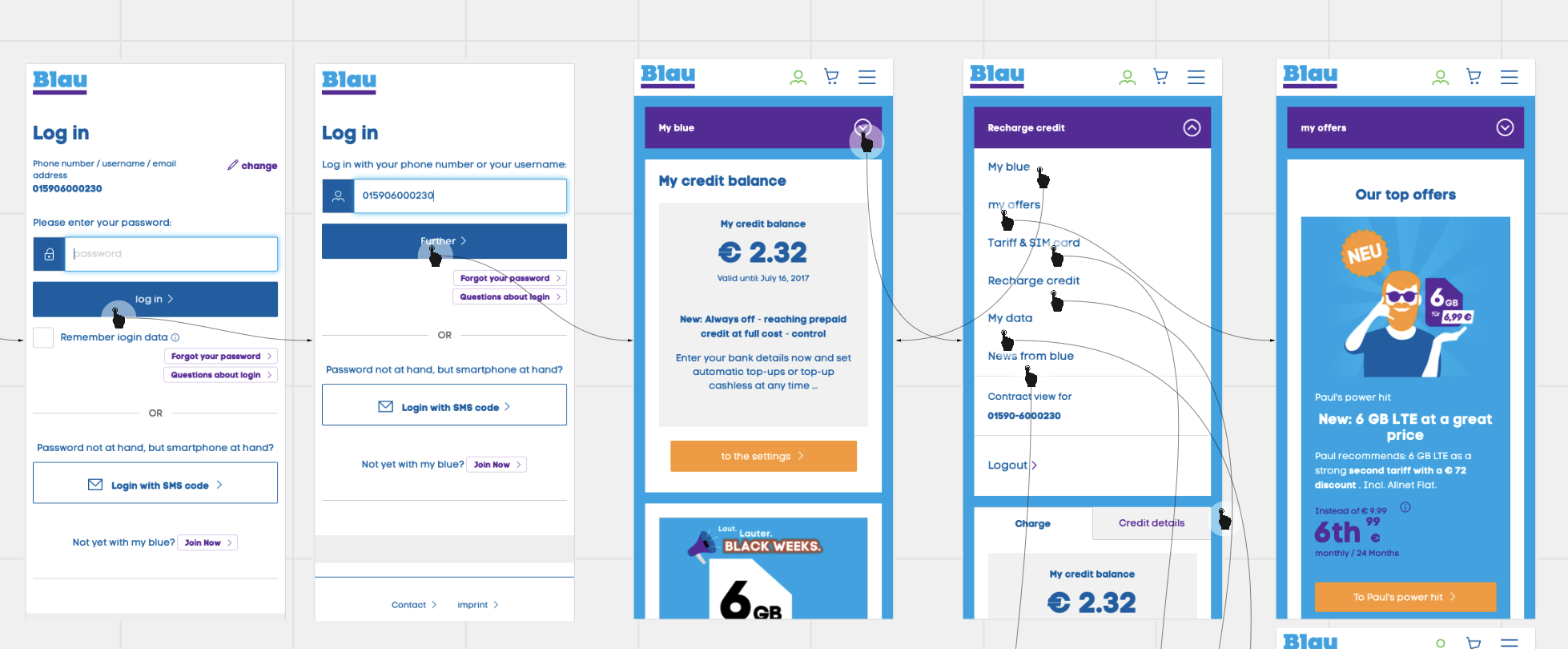
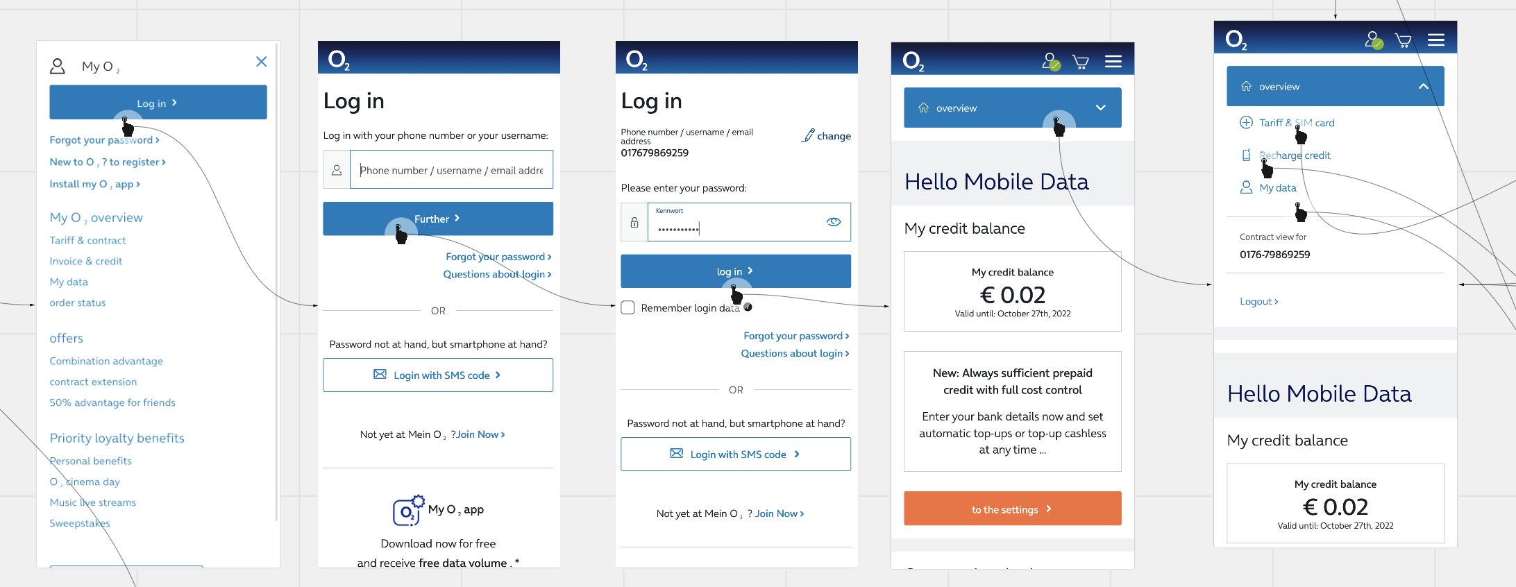
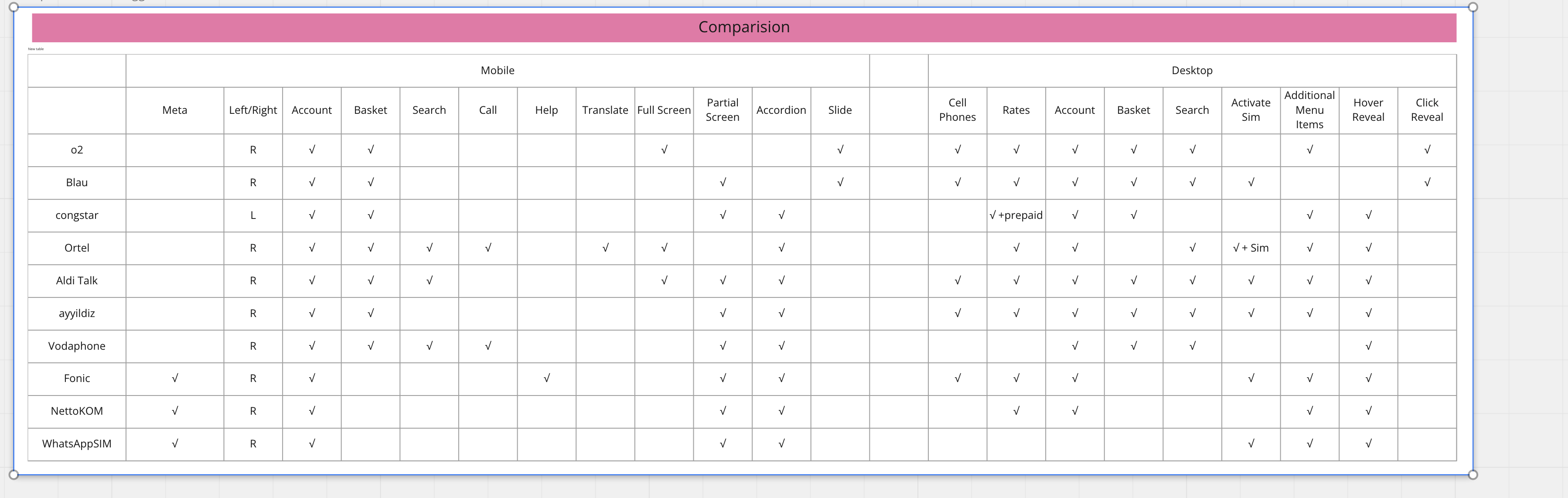
Comparison and analysis of the current navigation structure, flow, micro animations, menu positioning and functionality of various brands.
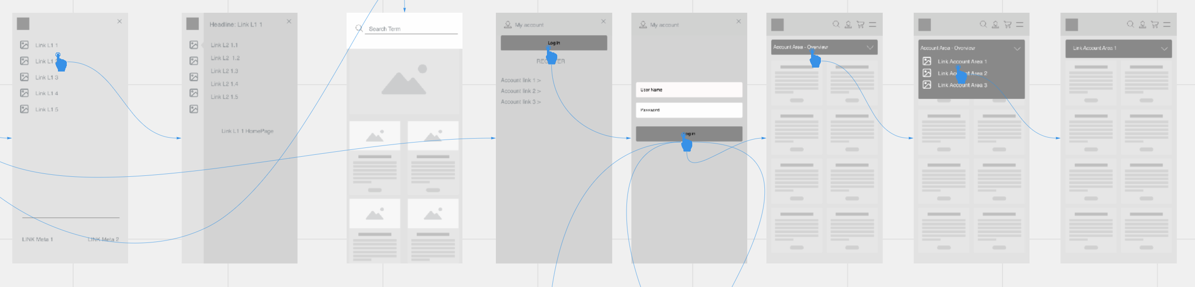
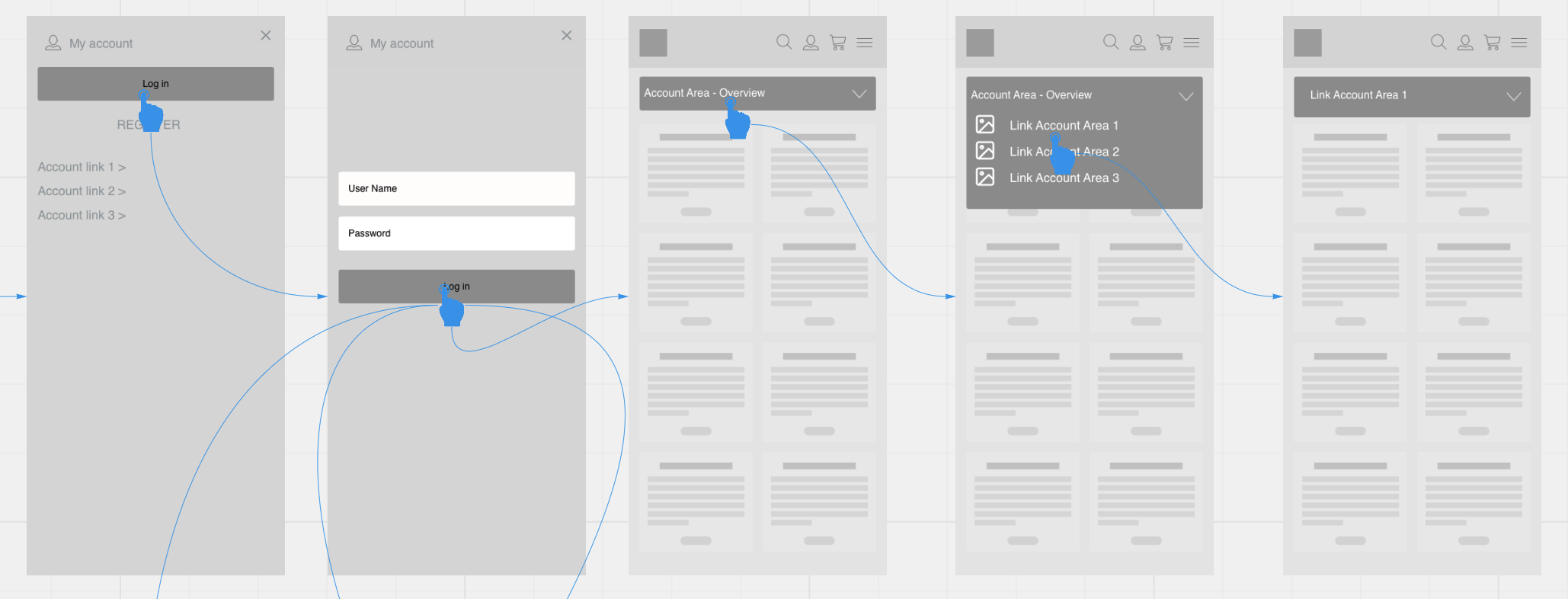
Low fidelity screens and journeys were created highlighting common and best practice approaches.
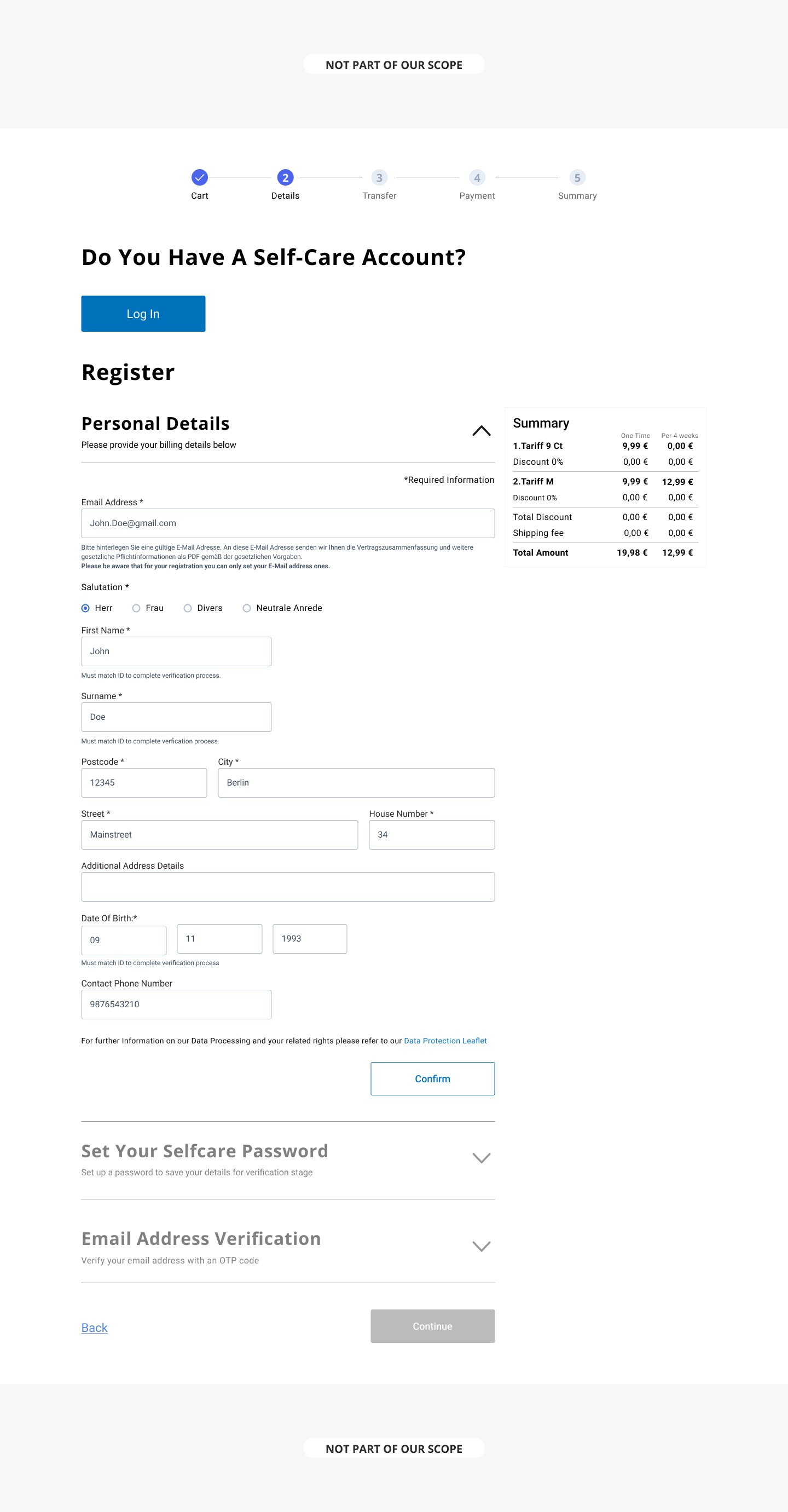
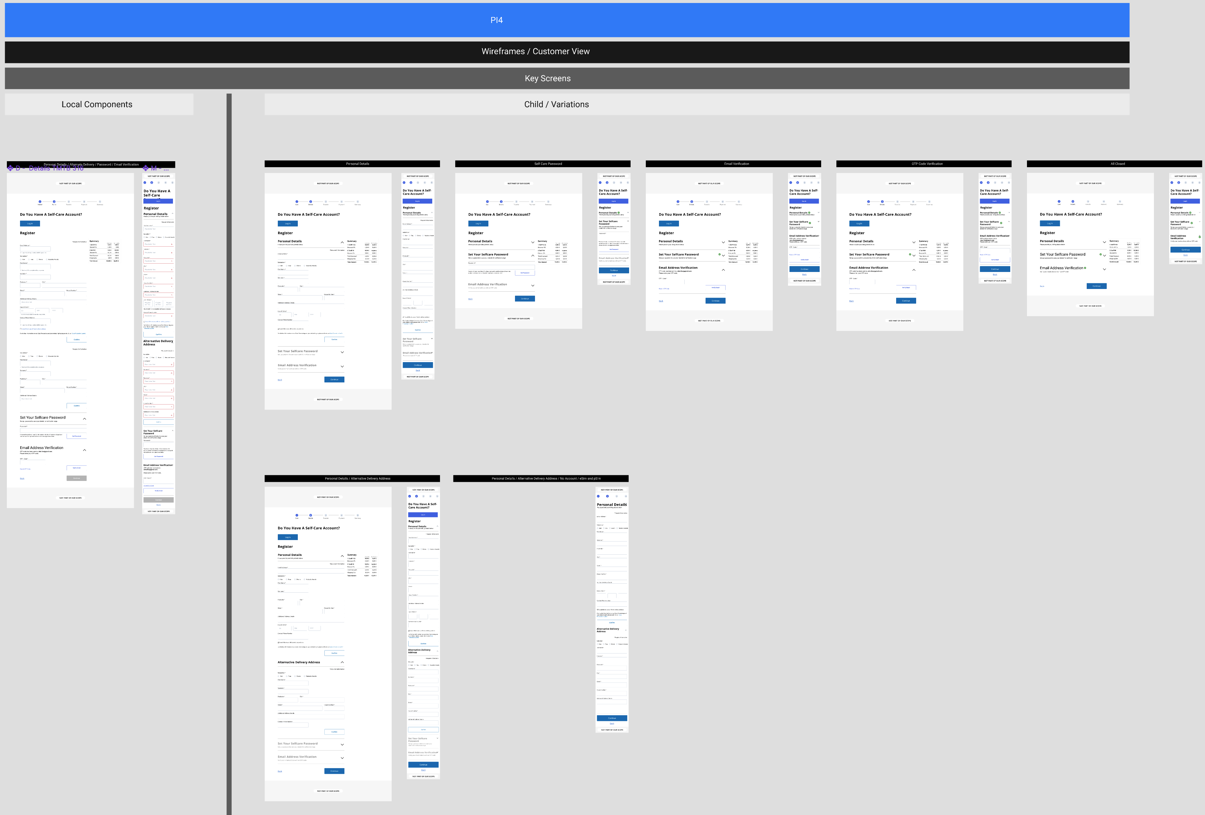
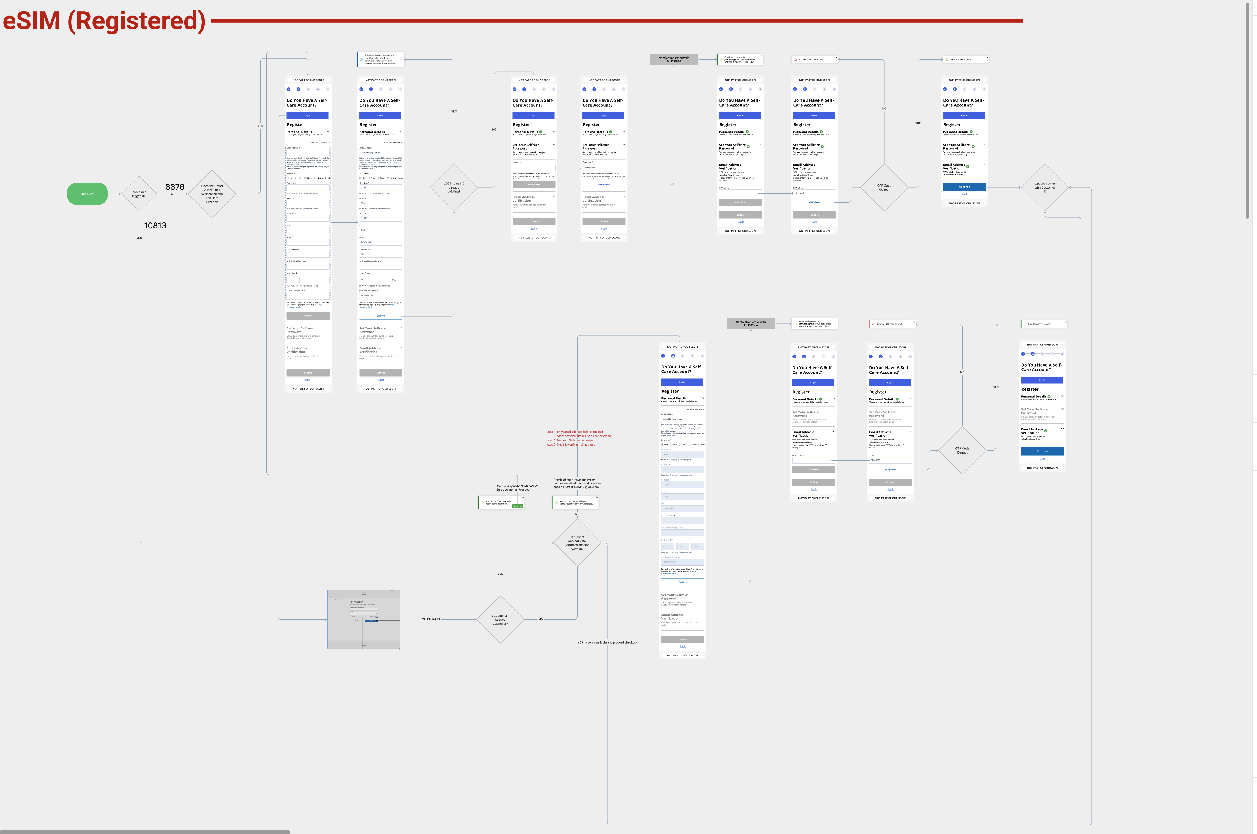
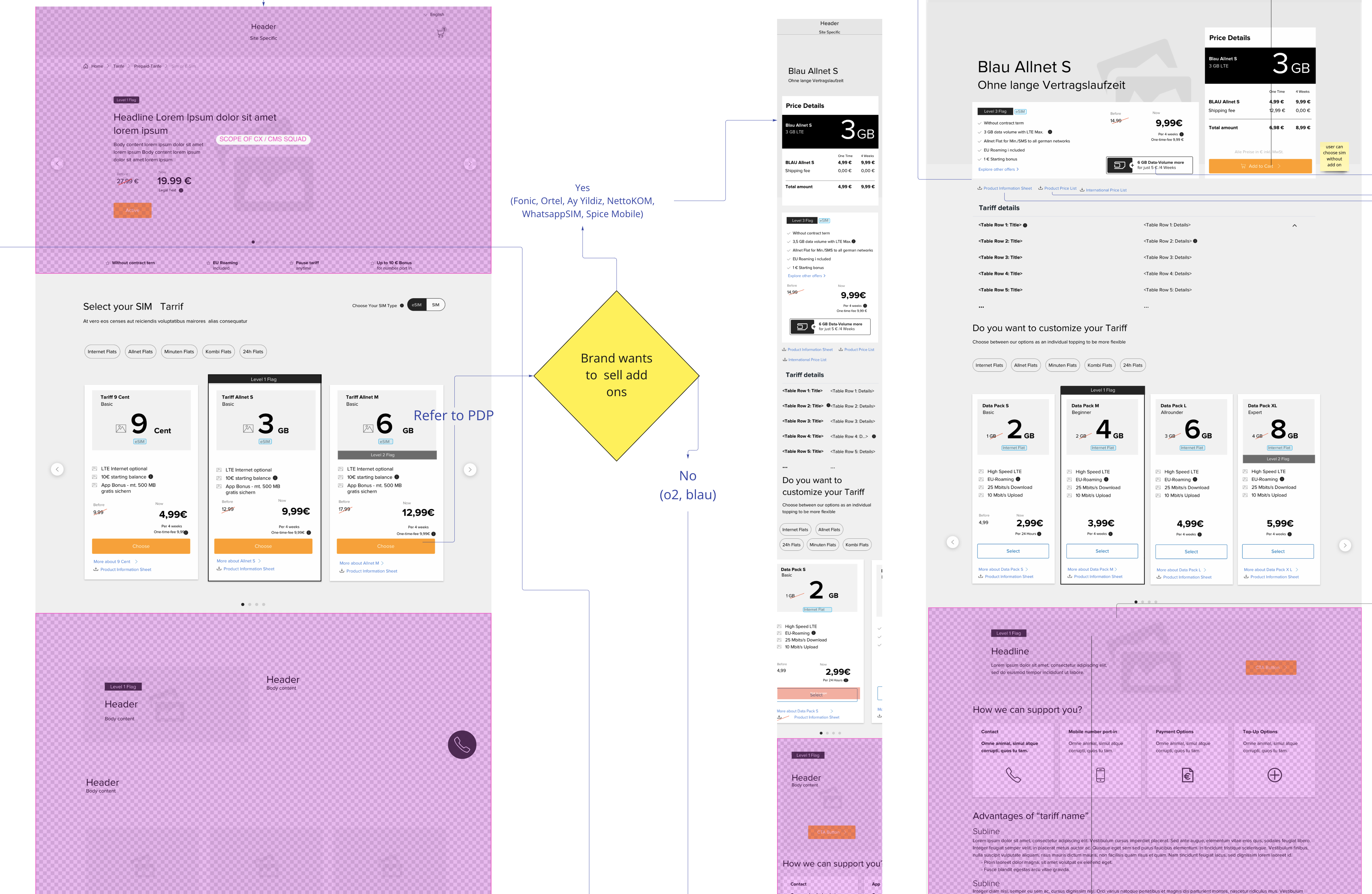
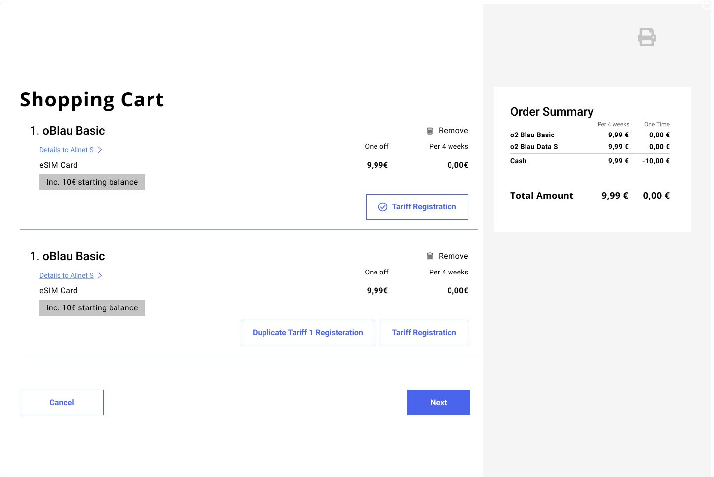
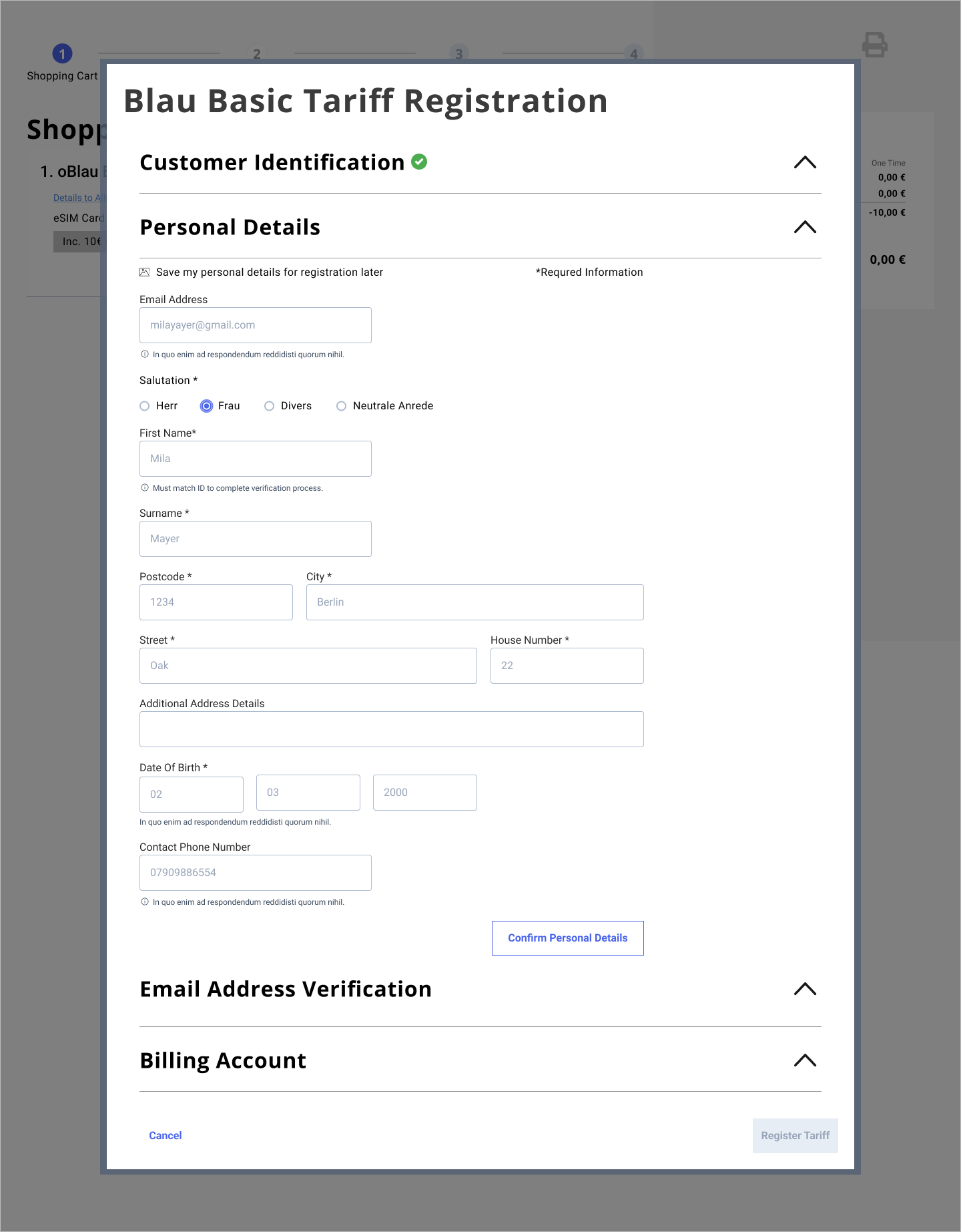
One of the journeys that I designed crossed multiple channels was the purchase and registration of a SIM card, via web, mobile and retail outlet. The challenge here was to reuse as many components as possible across all channels.
As much as possible components were to be reused across channels. In the this example the SIM registration was used in the retail application. Some modifications were required as the user of this application was primarily shop assistants tasked with entering customer details in store. SIM registration was included within a modal rather then inline.
Costa identified a market opportunity with the staff at Milton Keynes Hospital. Busy staff currently don’t have the time to wait in line at the Costa shop for their coffee hit. Traditional delivery methods are not supported within this closed environment, so how are they able to provide coffee to these staff members and increase their sales revenue?
ROBOTS!!
Further developments to Costa’s loyalty app will provide the opportunity to build foundations for Costa’s general delivery. Exploring both human and robotic delivery.
I led a team of UX designers and researchers requiring us to:
An analysis of the current “Click and Collect and “Click and Serve” journeys was essential to identify components for reuse.
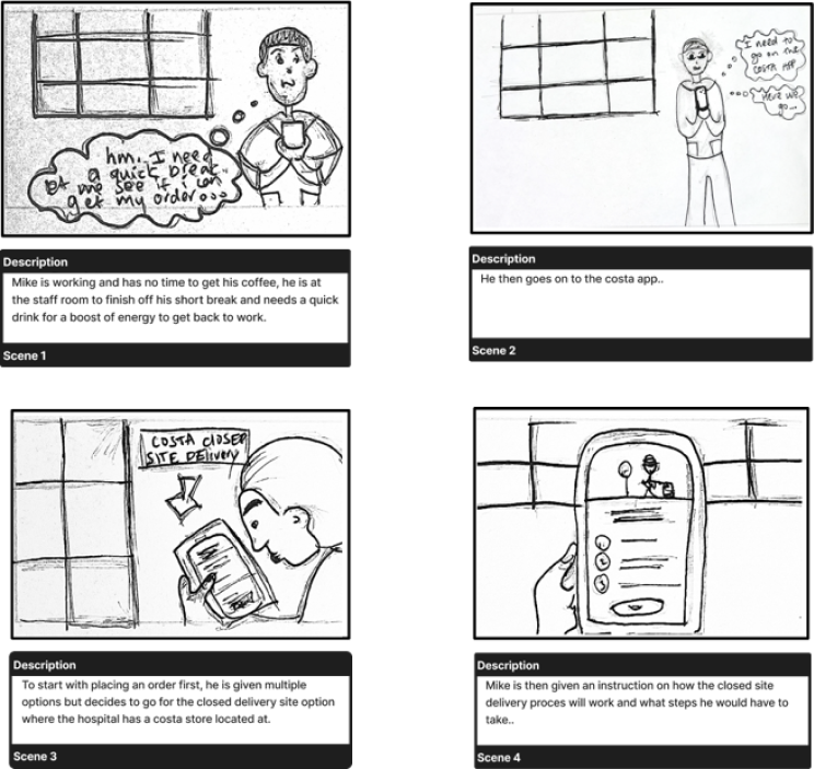
Storyboards were created roadmapping the journey. These helped designers, product owners and developers empathise with the user and give clear requirements for the APP.
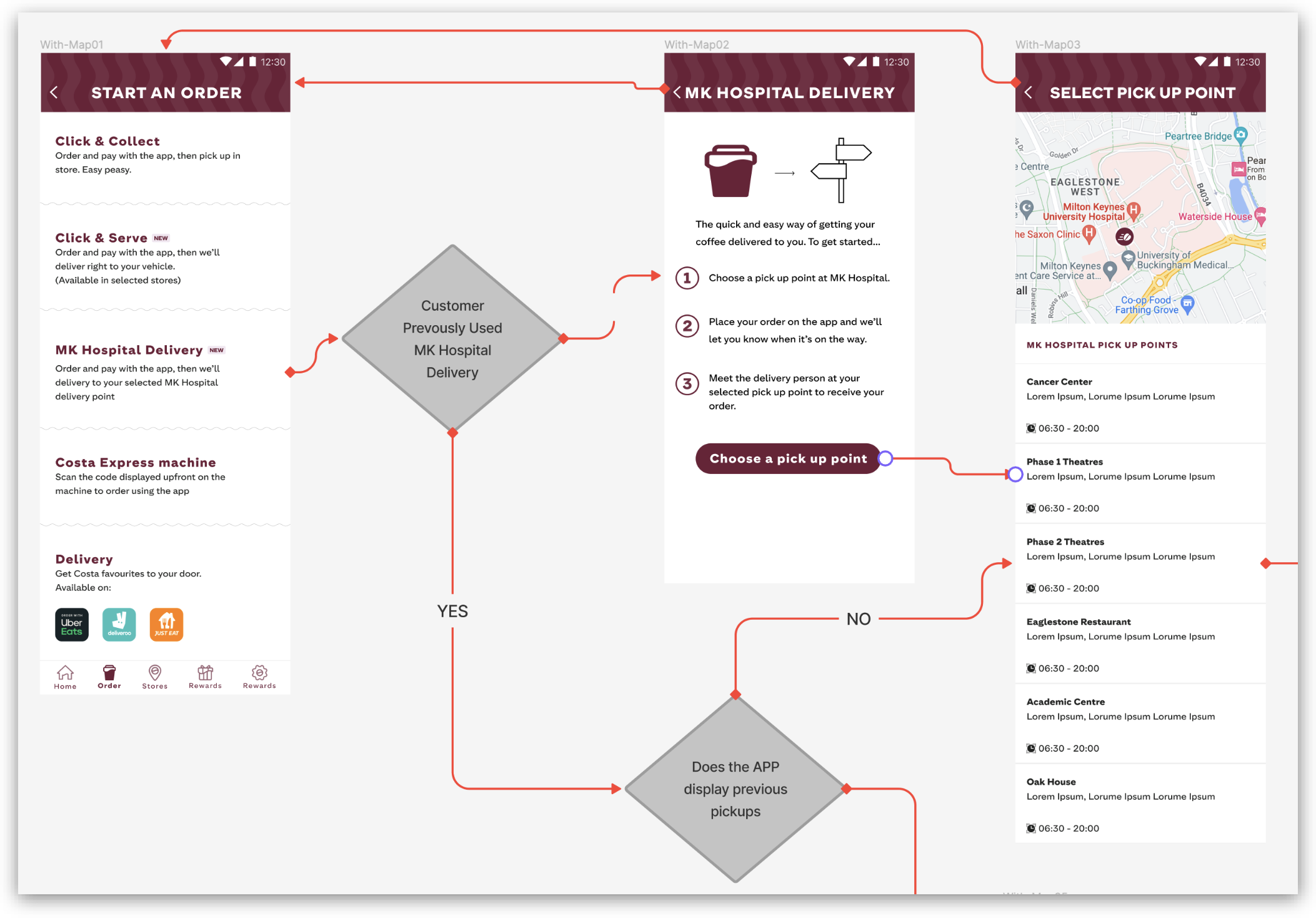
The storyboards helped identify screens for design. Lo fidelity wireframes were created and decision trees displayed the journey.
Costa’s existing design system was utilised ensuring rapid screen creation.
Live feedback sessions were held every two days with Costa design team and Figma was used for asynchronous messaging and feedback allowing rapid iteration of designs.
A seat on UserTesting was provided by Costa. Both moderated and unmoderated testing was completed. Moderated testing included 5 participants, unmoderated 20 participants.
A user testing report was completed with key findings and recommendations.
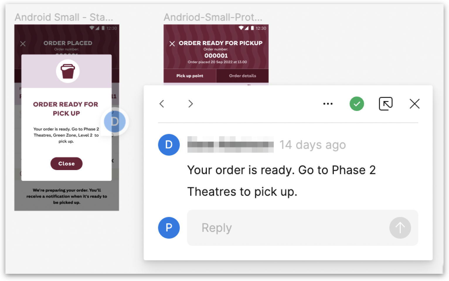
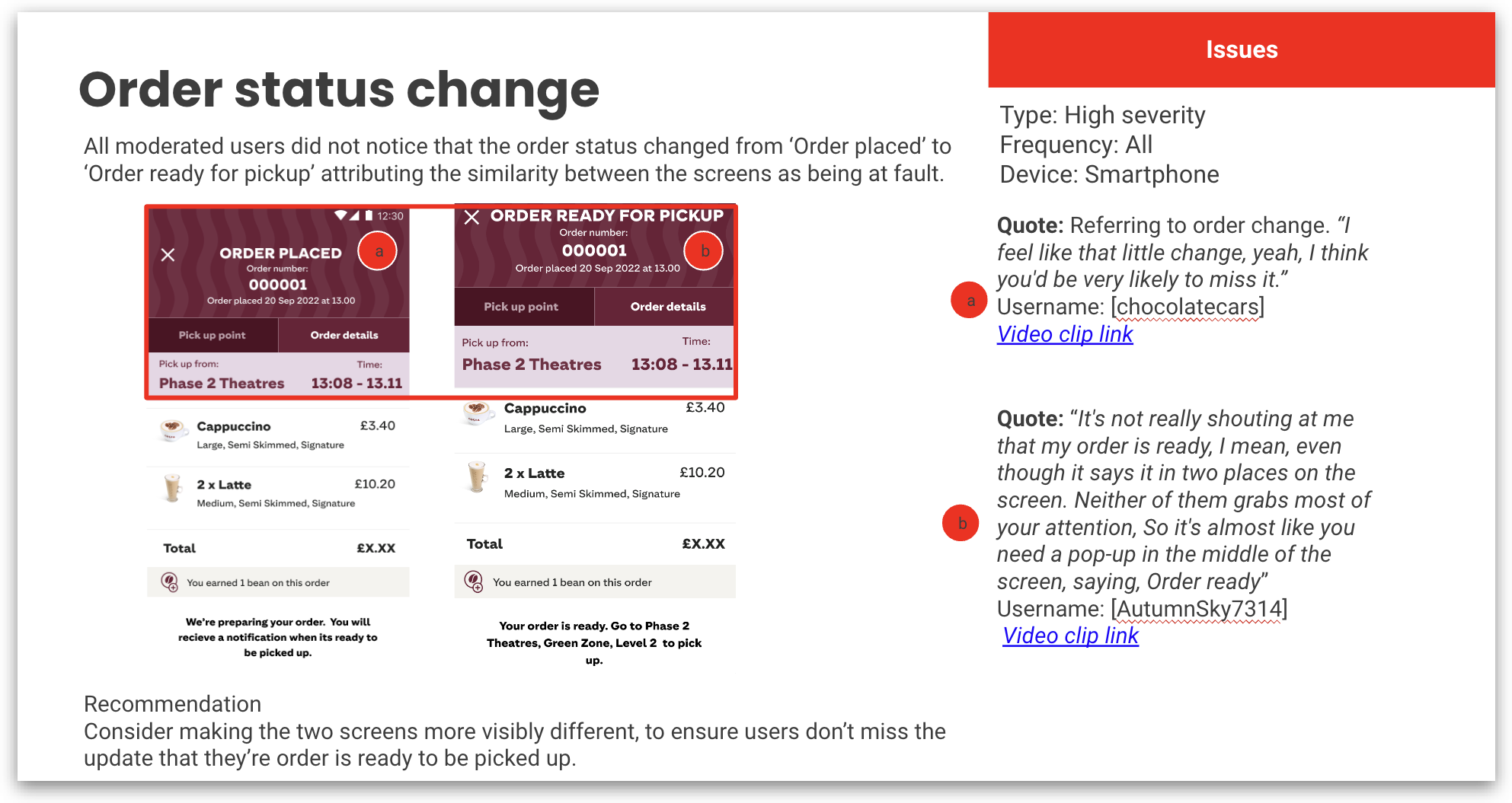
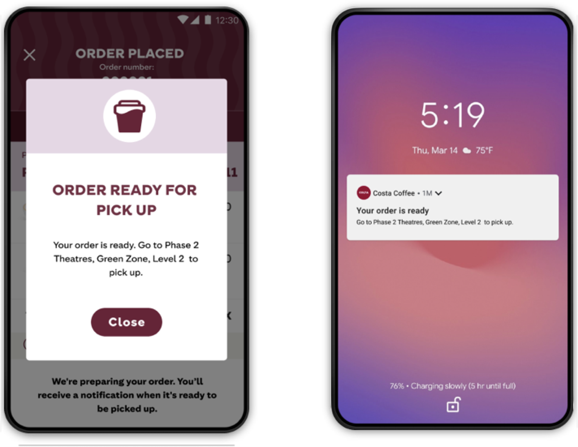
The most sever recommendation being; The status change from ‘ORDER PLACED’ to ‘ORDER READY FOR PICKUP’ was missed by all users, common feedback theme was the need to make the two screens visibly different for users to notice the order is ready for pick-up.
Based upon the evidence in the usability report additional screens were created.
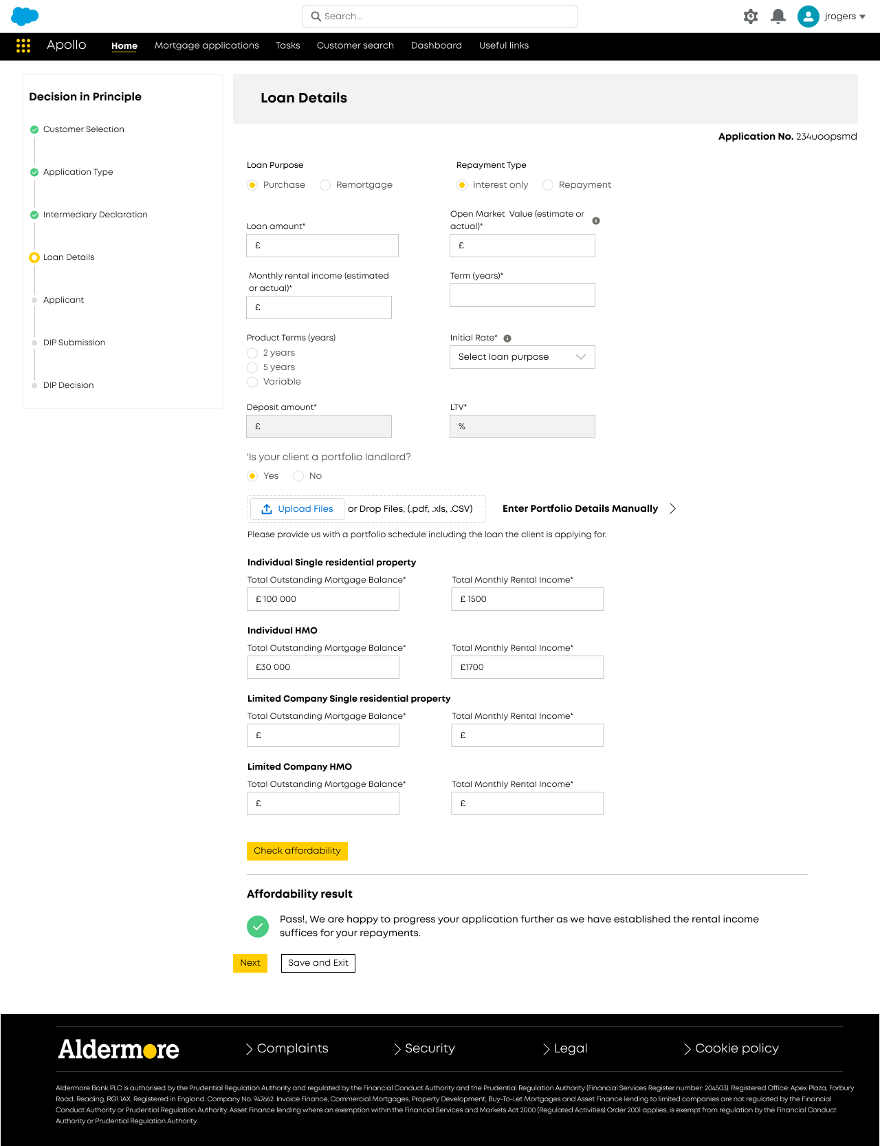
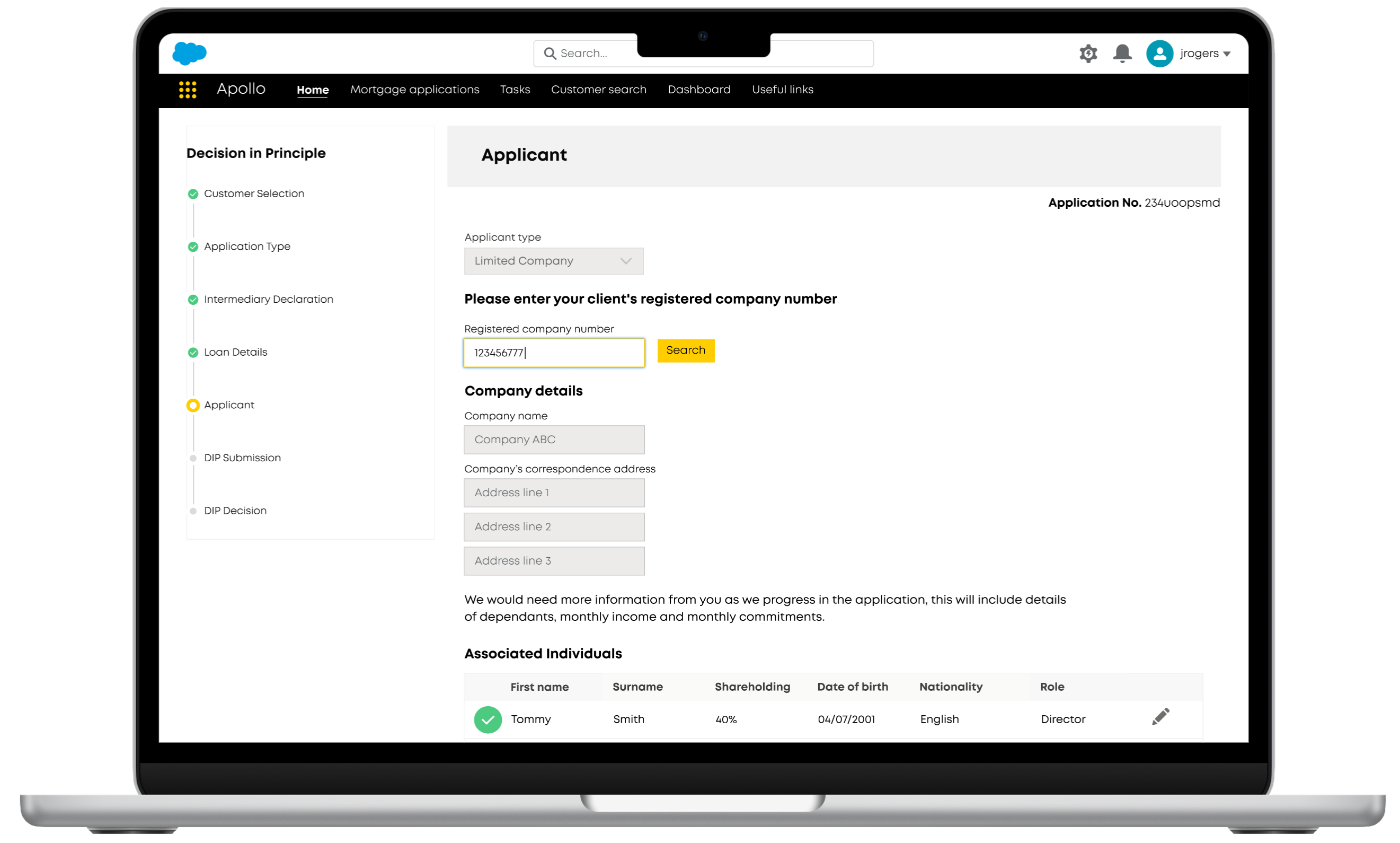
This role required the UX research and design for a broker/underwriter portal for Apollo mortgages. The supporting CMS for the application is Salesforce. A number of end users needed to be considered within the application including brokers, underwriters, decision makers and various colleagues within the bank.
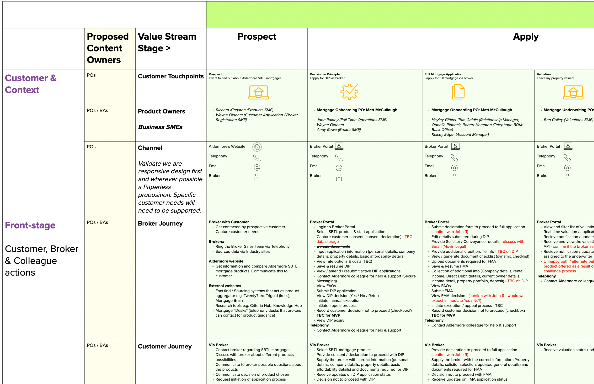
I worked with various squads and teams helping to create a service design blue print outlining and planning business resources in order to better improve the brokers experience and also the underwriters and decision makers internal to Aldermore.
A decision map was created outlining the mortgage application process with all possible macro and micro decisions being outlined. Key screens were identified on the decision map.
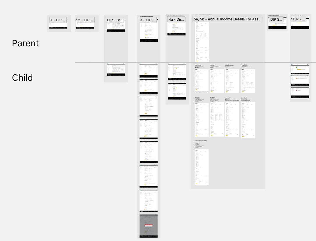
For each key screen a parent screens was created. Each parent screen had all iteration/decision variations included and displayed. Child screens displayed micro-decision alternatives.
The following screen is the parent company details screeen with all mircodecisions displayed.
Clickable prototypes were created and tests setup in UserZooom for both moderated and unmoderated testing. Some findings of intitial testing suggested that brokers were not confident with any data that had been captured via Customer House. Suggested alternatives enabled the broker to add and update details. This alternative has yet to be fully tested.